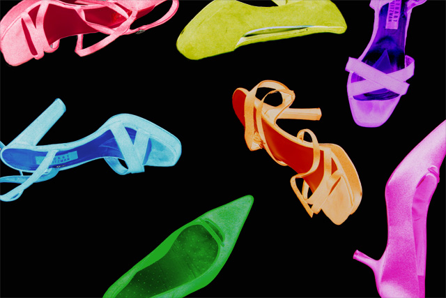
Not the 1st artist you thing of when speaking of photography... or maybe it is, but I love his work so much I couldnt pass this one up. I dont expect this to do very well, not DPCish but i did this one just for me!
---------------------------------------
To get this look i inverted my entire image, evened out the background and used the color balance on each shoe
Statistics
Place: 46 out of 188 Avg (all users): 6.1555 Avg (commenters): 7.2500 Avg (participants): 5.9459 Avg (non-participants): 6.2500 Views since voting: 1920 Views during voting: 391 Votes: 238 Comments: 20 Favorites: 3 (view)
I like the pop art of Andy Warhol.
this is a nice tribute to that.
a small nit pick (does that phrase refer to head lice?) would be to remove the stickers from inside the shoes.
there are only two and it didn't detract from the score I gave you (7), but i just think it would make it look better overall.
oh, i also wonder what this would look like with a different colored background?
i kept bringing this one up higher on my voting ladder. i dig andy's stuff a lot and was too critical at first of your shot. nice job. i love the different color choices, but i might have gone with all different lady shoe styles instead of having one or two repeat. and maybe all the same color too, but one different color in there. like all orange, but one purple. i dunno. just blabbing. like andy
Ahhh Warhol and his psychedelic colors. This to me looks good but has definite room for improvement. As a suggestion, maybe the photo was taken from a different vantage point. From up above for example so you are looking down at the shoes and the shoes are all arranged in an orderly manner. The coloration is great and I think it best reflects Warhol's art pieces but the "haphazard" positioning of the shoes leaves little interest to hold you viewer to pause and take in the image as a whole composition. My opinion of course ;)







 Add photograph to your favorites
 Add photographer to your favorites


 Photographer found comment helpful.


