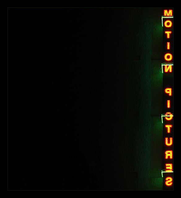
I probably won't vote in this challenge, but I have to tell you, this is an awesome shot. Very thoughtful and terrific use of negative space. I'll notch you for a 10 just in case I do get around to vote in this one. I've been too busy voting on the Best of 2005.
The reversed letters really appeal to me, and I love all of the negative space on the left. Nice complimentary colors, makes the lettering stand out even more. Great shot.
I don't know what the title means, but I like the daring composition of this image. The mirrored letters in the strong vertical postion coupled with the extreme negative space makes this image very compelling. My only 10 so far.
I like how the neon letter are reversed. I also like the use of negative space, but for me, there is almost too much negative space. I'd like to see this cropped in a bit more from the left, but that's just me. 7
Hmmm... The border doesn't work for this one. It detracts from the delicate lighting at the edges. I like the use of negative space, however, I fear that people won't like it because it's dark.





 Add photograph to your favorites
 Add photographer to your favorites

 Photographer found comment helpful.


