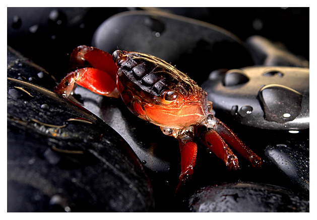
TECHNIQUE Focus is excellent with a very neat sharpness zone and softly out of focus in both background and foreground, gently drawing attention to your very bold subject. The droplets of water on the rocks are a very nice touch but make for a little bit of a dirty feel at the front left, not a problem though. The textures are interesting and have a wild feel, as though the creature was caught in its natural habitat (was it?). The exposure is great - just a little loss of details in the shadows but the highlights are managed perfectly. The colors of the crab pop beautifully and contrast nicely with the surrounding rocks. Technically, a great shot!
COMPOSITION I think the composition is perfect. The centeredness of the subject works great. I wish I could see more the crab's legs, but again, it feels very natural that we can't since he seems to be going about his business, not necessarily posing for your camera. The angle his body and legs make with your composition/crop is excellent. A squared "face on" shot would not have worked nearly as well, IMO. As it is, it feels very natural for the eye to wander around the diagonals and go from creature to rock to water droplets and back again. This is a beautifully simple composition that focuses the attention where you want it to be, without distractions or unnecessary elements.
EMOTIONAL IMPACT It's a beautiful image that has a lot of pure eye attraction due to the colors, the dof, etc. as mentioned above. Since the challenge was "signs," I'm sure you left some of the voters scratching their heads for a moment or two, but your title should dispel any doubts at all. I imagine that you were one of a few photographers who ventured outside the box, but still managed to find a hook to the challenge that most voters were able to swallow. To me, this image has a lot of appeal because it is so well done technically and because it's interesting to boot. Those eyes are amazing (I think that's the right one bulging out there on the left side). Well, people got it AND liked it. You can't go wrong if you reach the voters to that extent. Your final score of 6.3 was pretty good, and indicates that people appreciated your efforts, as did I. Excellent image and one I definitely enjoyed the chance to study for this critique!
Hee hee hee. Awww, cute littly guy. Nice alternative and creativeness to street signs. The white border is a bit too wide for me, but that's being nit picky. 9






 Add photograph to your favorites
 Add photographer to your favorites

 Photographer found comment helpful.


