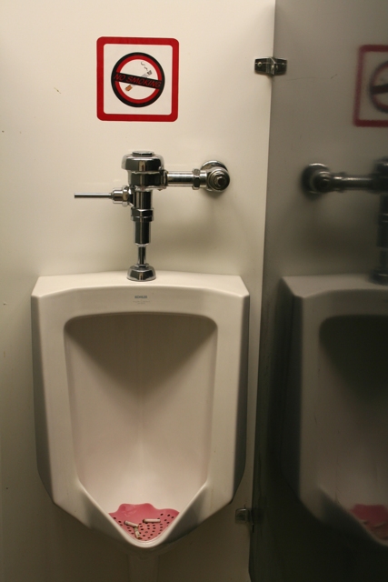
the lighting is not very attractive here, and the diagonal line isn't working either, for me. I get the relationship between the butts and the sign, but I personally don't think there's more to this than that.
I like the idea, but I think a different angle would be better. I would have tried it with a higher angle, with the no smoking sign at the top of the frame and the cigarrettes and the bottom of the toilet in the bottom of the frame.







 Add photograph to your favorites
 Add photographer to your favorites


 Photographer found comment helpful.
