good job, nice pic. ;) (I always wanted to impersonate Dustin)
Seriously, I think you've done a good job with an unruly subject/model ;) I like the lighting on the right, though its a bit TOO bright on his arm (But I can live with it..it contrasts with his dark side) Great job, A!! :)
I like the idea of a smaller light just to capture the contours of his back, too.
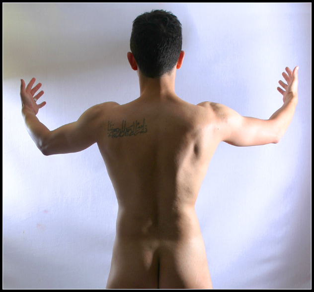
Hmmm.. this looks familiar. I think I know who the subject (and thus the photographer) is. I really like the light down the right side of his torso, but I would have liked to see a bit more lighting to highlight the shape of his back.
A very striking image. Personally I find the background too bright on the left - it's caused the left wrist and forearm to be over-exposed. There also appears to be spots on the lens or background in the lower third of the left side.
The tattoo looks awfully familiar :-) Good pose, very original. The lighting is also very enhancing. The only bothersome part are the little spots in the lower left hand area.
Good concept. I think it would have been enhanced with stronger sidelighting to create deeper shadows and a more uniform treatment of the upper left background.
I think this is the best male nude of the challenge - a few tiny hot spots, and in the lower left there are some dark spots on the background that are a bit distracting. A bit more play with the lighting and this would have been a 10. I'm giving it an 8 as it is. Nice pose and I like the symmetry.
well, maestro.. what are you conducting? light? life? are you the image of God creating Adam? So much can be read into this image. I am sure others have their interpretation - but that is what elevates an image above the rest.
Lighting is nice as it almost sillouettes, but then also shows the features of musculature nicely. I have seen that tatoo before in another challenge! LOL
So, I have 2 guesses as to who the photog is. I will see after the challenge :P
Nicely done!
The pose works well, the light and shadowing on the body also work nicely, but I think the background poses problems. Those redish spots on the bottom left would have been better off avoided (especially since you could have spot edited them out) but even ignoring that, I think the lighting on the background wall doesn't work out. An evenly light plain white background (or perhaps with a gradient from the top or bottom) would probably work better than the odd streaks of light intensity in this shot.
exposure seems a little hot on the backdrop, and a little cold on the figure's back. bringing the lightmore from the back, and a little less from the right side would even it out a little. Interesting composition - different.
great shot. Love the angle. Not that I'm gay or anything, but great physique (lol. reference to Rudy on Survivor. lol). Good luck. Did you try this in Black and white? 9






 Add photograph to your favorites
 Add photographer to your favorites

 Photographer found comment helpful.


