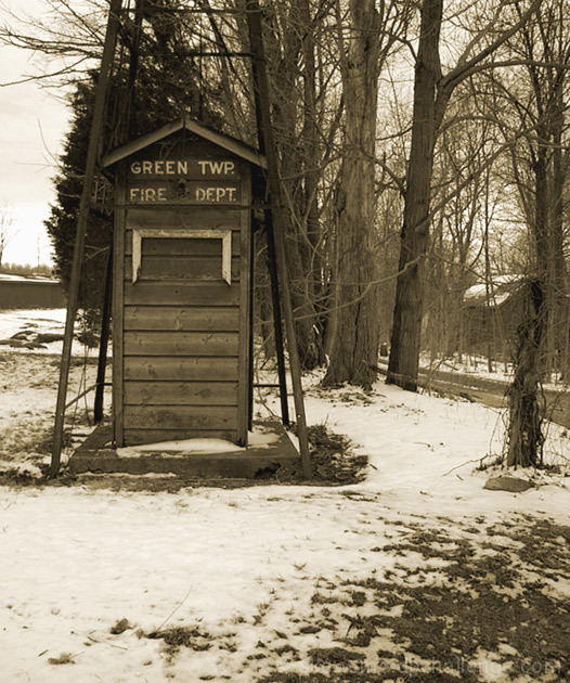
Funny shot - Scored it a 6 during the challenge. I like the choice of sepia tones, but probably would have bumped up the contrast a bit. Cool find - good eye for spotting it.
Pleasing image, generally, but the titling is a bit odd and I don't draw the connection. A simpler title would have added punch to the presentation. Contrast wise, i do think slightly more push would be very effective here. There's a tuft of a tree on the left side of the frame that is distracting to me.






 Add photograph to your favorites
 Add photographer to your favorites

 Photographer found comment helpful.


