I did not write any comments in the description of my photo for the Nudes Challenge, so here goes:
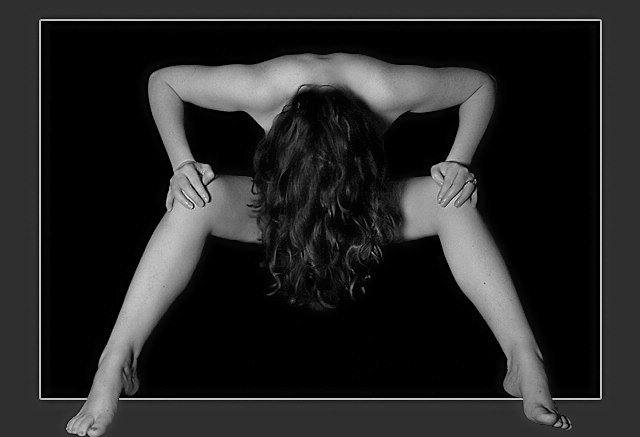
My model is actually sitting on the floor on a black backdrop, with her feet outstretched in front of her. My camera is setup on a tripod in front of her, above her head, aiming down at her. She was actually mostly dressed, but the idea was to hide the privates anyway, so it didn’t really matter, since the idea was to only imply nudity. Also, it made her feel more comfortable, as this was our first “nude session” together.
Lighting was very simple, one light (60 W) off to the left, about the same height as my camera, aiming down.
We tried several poses with the hair like this. Hands on legs, hands down in front of her legs, but settled on this one because of the nice lines it created, and the shape of her shoulders. Her non-symmetrical feet were an oversight on my part. I’m still learning…
In Photoshop, I adjusted levels, converted to BW, very little cropping. I sent the photo to Neatimage to clean out the noise that was left, and to soften the skin a little. Back to PS to burn the skin a little, and dodge the hair to bring out the curls and highlights. Resized. The border required a little more photoshopping, but mostly involved creating a duplicated layer of the feet to sit on top of the layer with the border. I tried several different types of border in this style, but settled on this one because it gave the non-symmetrical feet some purpose. Once the border was added, the pose changed. It suddenly looked like it was taken head on, and that she was somehow standing like that.
Now came the hard part: convincing the model to let me submit the shot for the challenge. The model is, as the title implies, VERY shy. After much discussion, and convincing her that not very many people would even see the shot, she agreed. On Friday morning, she called me and had freaked when she had seen the shot posted for voting, on DPC. She freaked because it was the FIRST shot that came up on the voting page. When I told her that the shot has scoring above 7.2 she freaked even more, since she realised that the shot might win, and would therefore appear on the front page, for the better part of a week. She got used to the idea over the course of the week. She is almost OK with it now.
Finally, I mentioned to her that some people had requested that I make this print available on DPC Prints. I asked her opinion, knowing what the answer would be, and she cringed at the idea of a total stranger having her “nude” hanging on their wall. I have to agree, that it would be a little odd for me as well. After all, MY MODEL IS MY WIFE. She agreed that we could make one print, for ourselves, but has not yet figured out where we would hang it. Over the mantle, perhaps? ;)
Anyhow, that is my “nude” story. I thank everybody who commented. Your comments are VERY much appreciated.
Mario
Statistics
Place: 3 out of 58 Avg (all users): 7.3967 Avg (commenters): 7.8611 Avg (participants): 6.9804 Avg (non-participants): 7.5564 Views since voting: 30601 Votes: 184 Comments: 51 Favorites: 35 (view)
had i the courage to do nudes--this is the sort of thing i would do! love the pose and composition--'specially love the perfect lines formed by her body. lighting is superb. congrats!
This image is my only 10 for the challenge! The composition is exceptional, as is the lighting , focus, etc. It is modest, yet interesting, but still naked! The limited digital art works very well here. I predict your image to win this week. Good luck and I hope it happens!
Ok this is my favorite photo this week. I love the symmetry of her shoulders and legs. The title says shy and having her hide her face and using her hair to hide her other unmentionables in this way complements the title perfectly. I love the sharpness of the photo and the ingenuous way of having her feet come out of the frame, which also complements the overall picture. I wish I took photos like this, perfect lighting, perfect focus, blah blah blah, I could go on all day. Well done a true blue ribbon! 10
Oh please make this available as a print I would love to have one.
Great lighing and composition. One of the few cases where a frame is used well - it give the picture a further dimension, the model is being viewed either from above or the front.
This is a great idea and a wonderful image. I like the tones and the symmetry, and the feet coming out of the border was a really nice touch too. It is almost like the person is coming out of the photograph. I'm not sure there is anything I would change or see negatively. I could see this hanging on a wall.
This looks a lot like one of the photos I have on my favorites list Spooky by joebar. Very nicely done! I love the feet coming out of the frame... I'm guessing she was on a chair? I'm not sure someone could stand that way... but maybe. I love your black background and your lighting...very symmetrical and nicely done image. The only thing that somewhat bothers me about this photo, is the fact that all of your sides of your frame are equal except for the top one... not sure why you chose to do that? It bothers me quite a bit, and it detracts me from the photo, unfortunately I have to drop a point off for it... but it's still a 9 :-) Nice job!
I like how the framing was done. The pose is nice and the shot turned out well. If the feet were symetrical it might have helped, especially since the frame draws attention to them. Nice work.
I pretty much like everything about this image.. technical and subjective..
I don't like how her right foot doesn't touch the border like the left one does, and I think she should have removed her ring(s). The body position creates neat geometrics. overall good work.
I really like the strong sense of shape and symetrical nature of this shot. The exposure is also quite good with great shadow detail around the hands and great texture in the hair.
Very nicely done! I lke the contrast brought about by the grayscale. Critiquie: Symetry seems to be the theme from top to.... almost the bottom. Everything is so symetrical until you reach the feet.
I like the "stepping out of the frame" idea. I'm sure you'll get an equal number of people who say they hate it... but what're ya gonna do? :) I may have liked a little more space between her toes and the bottom of the shot, though. - 8
Very strong shapes in this - and excellent pose to protect modesty whilst still conveying "nude".
I don't like the way that the border is slimmer at the top - I would prefer it to be uniform width all around, even though that's quite wide because of your decision to have the feet "fall out" of the border.
Interesting shot... nicely composed, I like the way her upper arms and shoulders mirror her thighs. Lighting is possibly just a little harsh for my taste. I like the way the feet break out of the frame, but I think there is too much tension in them... the ankles need to look smoother I feel. 9
love this image.. flesh tones are great.. texture in hair is spot on and I like the pose too..I like the symmetry.. so only possible quible.. it would have been good to have the feet in the same position as each other.. my only 10
The border kind of works, but pulls the entire attention away from the picture itself.
It looks as though she is a readhead and has freckles on her arms. If this is the case, I would like to argue that you have wasted a model with infinite potential - get in close, show her characteristics.
When that has been said, I must say that you have chosen an unconventional way to hide her nude parts - which is cool. Not at all sure about the lighting, though.
very sexy. love what you did with the border, even though many will chastise you for it. I think it's very appropriate. lighting is a little strong on the left, so it throws the balance off a bit. I like it.






 Shy
Shy Add photograph to your favorites
 Add photographer to your favorites


 Photographer found comment helpful.


