Author Thread
Post actions
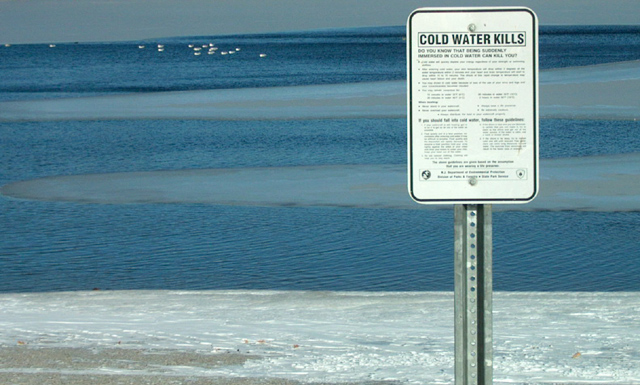
I like the composition of this a lot. I think some additional processing could make the water look more dangerous and cold.
Comments Made During the Challenge
Post actions
Interesting... After reading the "Do you know..." line(s), I'm still left wanting to read the rest of the sign, but find I can't in the image scaled for dpchallenge... would be curious to know what else it says. :-)
Post actions
Great shot. awesome sense of the cold. sharpness on the sign slightly off, and crop slightly tight on the top. love the shot.
Post actions
that's just sad, you have to have a disclaimer on a beach! are people rely dat dum 10
Post actions
The Seagulls don't seem to agree ;) love these deep blue colors contrasting with the shore
Post actions
That Funny... Wish Could read the fine print.
Post actions
Post actions
I like the offset sign that allows the viewer to get the feeling of the location. 8
Post actions
This photo lacks warmth! (Which is good because it is a sign about cold water!!)
Post actions
Post actions
more space at the top?
Post actions
great blues, great composition, but the sign looks a little out of focus









 Add photograph to your favorites
 Add photographer to your favorites

 Photographer found comment helpful.


