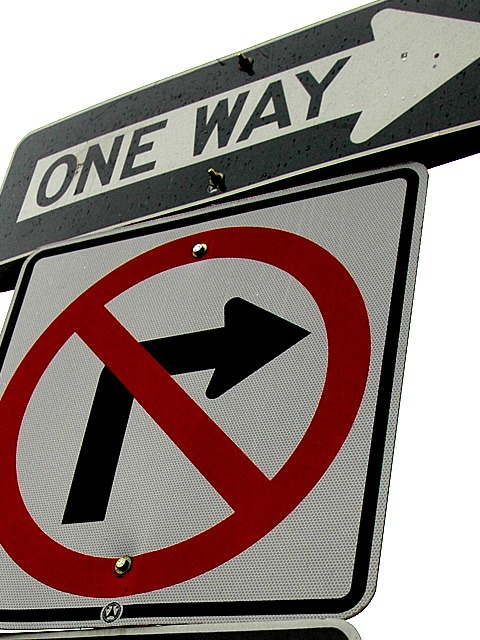
The funny thing is, this actually makes sense if you see the intersection :)
I took note of this many months ago, and luckily I remembered it when this new challenge came around.
I adjusted the contrast, boosted the reds, cropped.
It looks like I chopped the background out, but alas, I didn't. I'd probably request a DQ investigation on this one myself by looking at the outcome :)
Statistics
Place: 39 out of 186 Avg (all users): 5.7373 Avg (commenters): 7.0000 Avg (participants): 5.3210 Avg (non-participants): 5.9548 Views since voting: 1330 Views during voting: 316 Votes: 236 Comments: 14 Favorites: 1 (view)
The sign is nice and clear (also contradicting), but I want to see something more. A sign with a plain white background is just not interesting enough. If the background is just a plain street with a few cars on it wait until the sky is more interesting than overcast. A sunset in the background would improve this a lot. But it is a funny photo I guess some people just don't think about what they are doing when putting up these signs.






 Add photograph to your favorites
 Add photographer to your favorites


 Photographer found comment helpful.


