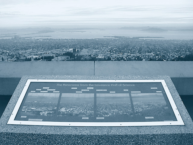
A sign on the esplanade of the Lawrence Hall of Science, detailing the features visible in the panoramic view of the San Francisco Bay Area spread out below.
The Golden Gate Bridge is straight ahead in the haze, just beyond Alcatraz Island, while the SF-Oakland Bay Bridge is on the left. The Richmond-San Rafael Bridge is just out of view to the right, along with Mt. Tamalpais, while Angel Island is visible in the right-center beyond the Berkeley Marina/Pier.
-RGB Curve
-Extract Green Channel to Grayscale
-Grayscale Curve
-Duotone Mode: Black and Cyan
-RGB Mode
-Resize for DPC
-USM at 16%/64 dia/TH=0
-USM at 88%/0.8 dia/TH=5
-USM at 88%/0.8 dia/TH=5 (second application)
-SaveAs JPEG at quality 8/10 = 133kb
Statistics
Place: 102 out of 186 Avg (all users): 5.2018 Avg (commenters): 6.1667 Avg (participants): 4.9351 Avg (non-participants): 5.3475 Views since voting: 1231 Views during voting: 308 Votes: 218 Comments: 11 Favorites: 0
I'm not sure if I like the overall lack of color since it keeps it consistent with the sign, or if I would like to see more color in the top half. Creative shot and perfect for the challenge. Nicely done.
There really wasn't any color in the original -- it was a gray,hazy day and this view is at least partly backlit.
At first I tried it in a warm sepia-like look, but though it gave the sky a nice glow, it made the concrete and the sign (the real subject) look a little funny, so I switched to a Black/Cyan duotone for that cooler, foggy look.
I understand that gray, hazy day stuff, yuck! I can't picture this in sepia tones at all...so this was probably your best choice then. No matter what the colors, I still think it's a cool shot :)
I tried a couple of things to bring out the dynamic range in this image... for Basic Editing, Adding a Channel Mixer at 120/-10/-10 definitely brought out the contrast a bit more; the image could be re-duotoned from that. For Advanced Editing, duplicating the layer, setting to Multiply mode, and adding a white-black-white vertical gradient added a nice sense of richness to the image, and helped out the sky a lot. In both cases I finished up with a USM at 60%, .3 radius, 0 threshold.
I'm another member of the crowd that thinks that this is a good picture and conceptually strong, just not presented quite as well as it might have been.
Well Im not sure HOW to make this better but I can tell you what I would work on. I like the foggy look of the city and the water but the sky needs more contast, it looks like there are hazy clouds there that arent blown and if you could get rid of a little of the brightness there they would stand out. The border of the sign is really bright. I would somehow darken that to make it not so glaring, the agtual sign would stand out more without the competition. I like the color scheme and the detail in the granite.
I'm not sure if I like the overall lack of color since it keeps it consistent with the sign, or if I would like to see more color in the top half. Creative shot and perfect for the challenge. Nicely done.
There really wasn't any color in the original -- it was a gray,hazy day and this view is at least partly backlit.
At first I tried it in a warm sepia-like look, but though it gave the sky a nice glow, it made the concrete and the sign (the real subject) look a little funny, so I switched to a Black/Cyan duotone for that cooler, foggy look.
I'm not sure if I like the overall lack of color since it keeps it consistent with the sign, or if I would like to see more color in the top half. Creative shot and perfect for the challenge. Nicely done.
Nice idea, focus, and DOF. Too bad sky is blown out and top half is hazy, better black (instead of medium blue-gray) levels and more contrast would help. Also consider an additional element of a person/viewer so you can get away from such a straight-on composition.






 Add photograph to your favorites
 Add photographer to your favorites

 Photographer found comment helpful.


