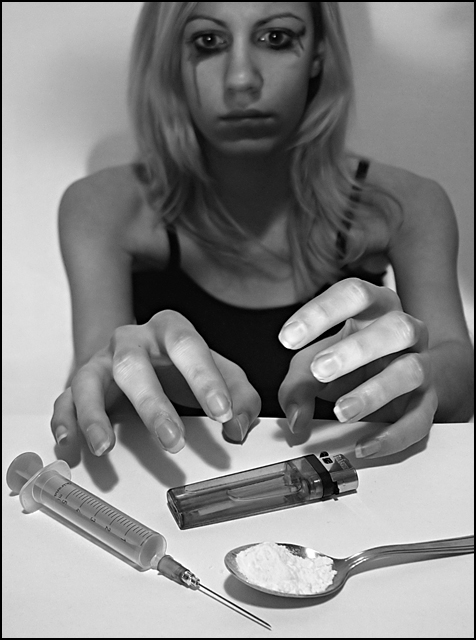
Interesting take on the theme - one of the stronger images that departs from the more literal interpretations. The only real thematic inconsistencies I see are with the model... her hands are too clean, her hair is too well done, and she looks too healthy. I think the black makeup might have been stronger if you gave her some 'racoon eyes' more than its just being smudgy; the sloppiness looks deliberate here.
On another note, though I think the title is pretty good, there are moral connotations I don't think I agree with. "Perdition" means "damnation," which implies that a drug addict is morally responsible for his (or her) addiction. While a user is, to a certain extent, culpable for the decision to use in the first place, addiction is much more nefarious and complicated, and when use turns into abuse, 'free will' as it is normally conceived pretty much goes out the window. If this were my image, I would have probably given it a more morally neutral title using something like "misery," "destruction," or "self-destruction" in place of "Perdition."
Great concept, i wont judge you on it, but i feel it would be better with more of a DOF, the light doesnt look to even but again i dont know if thats what you wanted so i wond judge you on that either. 8
Interesting take on the challenge. I hope everyone else gets it and it gets the score it deserves. well done for using some imagination instead of just picking the obvious. Technically, really nice shot - lovely tones & good sharpness. 9.
I had this idea for the road challenge myself. You may get flack for being too outside of the box from some people, but I think this shot is very effective and well done. 7.
intersting interpretation of the challenge.
the details are great and the b&w works well.
imo the make up is a bit obvious, but on the other hand it would not have worked so well without it.
out of the box but like it





 Add photograph to your favorites
 Add photographer to your favorites


 Photographer found comment helpful.


