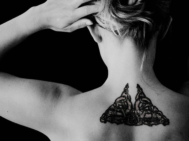
A friend of mine. I couldn't ask her to pose totally nude, so this is my compromise. I was aiming for sexy without showing anything, and I think the neck line is the sexiest part of a woman's body.
Colour was added back to the tattoo by duplicating the B&W layer, tinting it, erasing the B&W layer where I wanted the tint to show through. Thanks to Shizam for the idea.
Statistics
Place: 23 out of 58 Avg (all users): 5.7527 Avg (commenters): 6.6429 Avg (participants): 5.8824 Avg (non-participants): 5.7023 Views since voting: 4564 Votes: 182 Comments: 15 Favorites: 1 (view)
I like the composition a lot on this shot. The crop seems just tight enough and the points of interest (tatto, head, hand) are in good places. The hair adds interesting character to this shot as well, with the one strand hanging down and both light and dark strands showing. Originally I really didn't like the grain and the harsh contrast on this shot, and now I'm not so sure. It looks like this was overexposed enough to lose detail on the skin, and then darkened, (although that's just a guess) resulting in areas of the skin that are neither blown out or very detailed, which comes out kind of drab. So I guess my main wish here is some more detail on the skin, or else a high key look all around, but I don't have as much of an issue with those things as I originally did. Great work.
Hmmm. Am I voting on the photo or the tattoo? Tattoo gets a ten, Photo an 8, The lighting is maybe stark, the ink on the tattoo too dark. Nice negative space shapes. The best shape of all ths the V of white skin in the middle of the tattoo. I like that vulnerable white neck space contrasted with the harsh new tattoo/pain. the wisp of hair is nice too and the backs of the ears, maybe the arm competes with it because the arm seems strong? 8
This is beautiful, both the picture and the body-art. I like the slight pink tone to the inside of the celtic design. I like the soft light. Very nice. ~10
First thing that strikes me is the strong composition. I like the shapes formed by her crooked arm, body and the frame of the image. I like the way the main triangle of negative space is echoed by the triangular tattoo. I also like the way her hair merges into the darkness at the top right.
That said, I'm not sure about how much this says "nude" to me - given that one often sees this much skin just walking down the highstreet at this time of year (especially given current UK temperatures). If I could vote I wouldn't score down for that, it's just my impression, but I would say that this wouldn't strike me as "nude" if I saw it on another site, in another challenge.
Lastly, darkness: A tutor used to tell me, as I tried to work out whether I'd used a suitable exposure and contrast grade in the darkroom, to think about the white and black in the original scene I was portraying. If there were white highlights in the original then I should see some white in my print. If there were solid black areas in the original scene, I should see those in the print also. This is assuming I the scene was lit as I intended and I had successfully captured that on my negative. In this image, I assume I'm looking at a caucasian model, yet her skin seems rather grey to me. That said, maybe she has a slight tan or a darker natural skintone? Personally I'd prefer this to be a touch lighter over her arm and hand and shoulder blade areas, though it's about right at her neck.
Sorry for rambling...
:D
V. cool, but somewhat grainy (i kind of like it, though) and seems to have little or nothing to do with actual nudity. As a nude, however, it is a good shot, but perhaps you should have considered a square shot, and included more of her back?
like the high-key lighting and composition. the art leaves me wanting - more colour saturation or less. it's hard to tell if it's there or not. I'll look again later on a brighter monitor and see if my opinion changes. 7






 Add photograph to your favorites
 Add photographer to your favorites


 Photographer found comment helpful.


