First Impression:
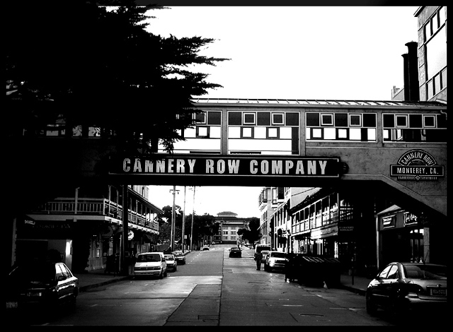
My eyes went to the black trees, the white sky, then the road area and the sign. The dark trees and white sky kept drawing my eyes away from the road. Very distracting.
Composition:
Very central oriented. May have been more interesting if you reduced the sky and included more of the road. Either move back or point down. I like the way the road leads my eyes down to the end.
Subject:
Met the challenge, but you may have focused more on the sign than the road.
Technical:
Since you didn’t include any details or text on what you were trying to achieve, I can only comment on what I see. Picture has a lot of contrast with very little detail. You lost a lot of detail in the shadows. The road perspective was effective so cropping the trees and sky may have helped.
Summary:
Picture has potential with some additional post processing steps. The road component is working, but the trees and sky compete for attention.
Too much contrast I think - too much detail lost in the shadows, and the sky is blown out to the point of featurelessness. If it was a cloudless day, then blowing the sky out would at least not highlight that any more, but to lose so much shadow detail lets down the picture. Maybe if you'd gone into the curves and adjusted the greypoint to bring out some shadow detail, this could have been improved.





 Add photograph to your favorites
 Add photographer to your favorites

 Photographer found comment helpful.


