Author Thread Comments Made During the Challenge
Post actions
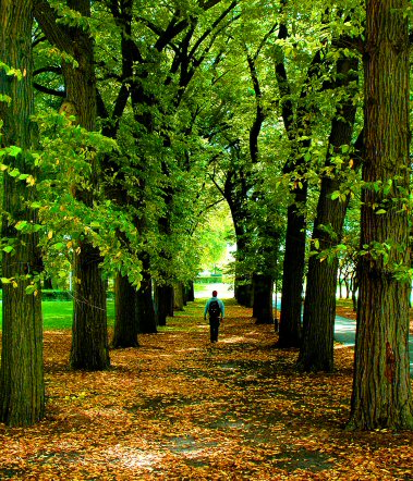
Very nice, the perspective and person draw your eye into the image
Post actions
This is a lovely picture, with beautiful colours. It loses a lot of impact through being a very small photo, resizing to 640 would have helped.
Post actions
The perspective is spot on, color is also spot on, and the image is spot on as well.....
Post actions
Nice, but that green is too limey to my eye.
Post actions
Post actions
great composition and use of depth of field....8
Post actions
Oversaturated colours. Classic theme.
Post actions
excellent picture, if it was full 640 pixels wide I suspect it would do even better. 7
Post actions
With a bigger photo (you have 640 pixels, use them!), this would have been a great photo.
Post actions
Post actions
great photo. I bet a black and white one would also look outstanding
Post actions
Nice image, but it's too small. Make sure at least one side is 640 pixels wide.
Post actions
Looks like a nice shot, but it would have been so much better if you'd used the full 640 pixels.
Post actions
Except for what looks to be slightly blown highlights, I really like this. Good texture on the leaves and tree trunks particularly as well as the colour tones. 8/10
Post actions
Very pretty, but it looks almost a bit oversaturated to me.





 Add photograph to your favorites
 Add photographer to your favorites


