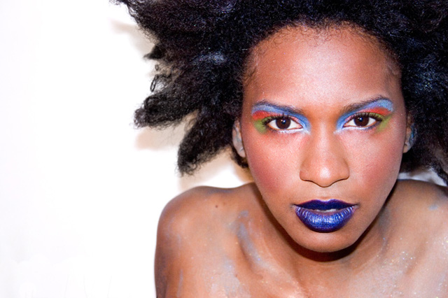
I like this photo, but am slightly turned off by the shadows on the white BG (sorry, big pet peeve of mine). Moving the subject away from the wall (I'm guessing that's what it is) would have helped eliminate this. Also, the shadow under her face is a bit harsh. I'd recommend foil, facing up toward her face, be placed at about chest level for this type of shot.
Overall, other technicals look pretty good and I love the composition, style and makeup.
I love everything but the title which is a stupid thing to complain about. The title implies that her eyes should be the focus of the picture? But I find her mouth to be equal to the eyes in impact and the ears close behind. The colors are wonderfully jarring, blue on the mouth which ought to be red, red on the eyes which ought to be blue. THe placement of the girl on the right when we usually see people on the left adds to the tension. The spikes of her hair try to lead ones gaze out into the empty white space but the face pulls you back so strongly that it is almost painful. Intense!
I'm not a fan of this sort of photo. Artificially made up models turn me right off. There are technical issues though, which really hurt this. She's too close to the background, resulting in the unflattering shadow. Skin tones are harsh, focus is off, and I think it'd have been stronger with more of the hair, and less of the body.
to me eyes are the window to the soul - but here the eyes don't grab me - the horrible make up job does. Sorry but the blue make up and lips are just too ove rthe edge for my liking.
I think the photo overall seems slightly soft, and the lighting harsh like you just used a flash without diffusing? I think if using a flash it should always be diffused by something, even just paper, or bounced, to avoid such harsh shadows.
The model is beautiful and intriguing. I don't think this is quite successful though. Her eyes aren't quite focused enough. Or perhaps it is that they are too far away from the viewer to make a strong impact. Her full blue lips are what draw my focus. Also, she should have been separated more from the background to avoid
the shadows. A light pointed at the background behind the subject can eliminate those shadows. I don't care for the dark shadow under her jaw line.
I think that is body glitter on her shoulders and collar bone but it appears a bit overexposed and is reading more like dust to me.
I like the pose, the composition, and the model is beautiful. I think this is suffering from improper lighting mainly. Nice effort.
I like the idea of this image a lot, but given that the title, the eyes really should be tack sharp, and to me they seem just a tiny bit out of focus. Also, there are hotspots on the nose and forehead that could be toned down a bit.
The windows or eyes are not in the best focus, wish they were, however the mouth and the nose were closest to the lens when you focused..beautiful skin..
Great colours. And I mean really great colours. Gorgeous really.
too bad the focus is on her nose, a bit forward of her eyes, making them a bit soft and also too bad about the slight shadowing on the background. maybe it's a bit too close?
For me, the star of this show is actually her lips. Wow!







 Add photograph to your favorites
 Add photographer to your favorites


 Photographer found comment helpful.


