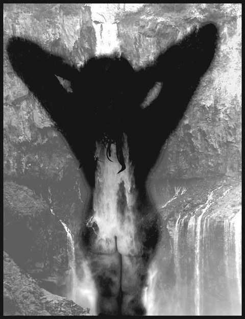
Took the main picture of the nude in the shower as wanted to get the water and pose more realistic. Then placed this layer over the background, did some spot editing to get the top half of the body darker and emphasizing "other" areas, with the water flowing.
Statistics
Place: 21 out of 58 Avg (all users): 5.7833 Avg (commenters): 6.8333 Avg (participants): 5.2157 Avg (non-participants): 6.0078 Views since voting: 8295 Votes: 180 Comments: 19 Favorites: 0
I hate it when this situation comes up for me... To me, this is what i would call 'digital art' moreso than photography. Normally, I don't care much for digital art, but it's probably because I'm simply more of a 'purist' photographer. I have always been one who looks for the photographic quality and themes when judging an image on this site. I must say that this is one of the first images I have seen that really falls into the digital art category for me that I'm really impressed by overall. I'm assuming that this is a composite image simply because I don't see (easily) any other way to do it. What I also see here is some very creative use/combination of photography and digital art to create your 'vision' for this piece. I'm impressed and moved by this image at the same time. Kudos on some good work :) = 10
I like this effect it is definetly something out of the ordinary. I like the way the water seems to be poring through the subject, which you achieved by the shadow. Was this all done in photoshop with layers and transperancies? 7
A bit on the abstract side. Nice! I don't like it, though, that the buttocks part of the model is so much clearer than the upper body that attention is really drawn there. I'd like to be at least as interested in the hair and upper back area, but with the lack of definition there, I just can't be.
Nice concept, well executed. Could also be used as 'The Star' in a tarot deck. I love the feeling of cleansing as the water runs down the spine. I'd love to see the steps you took to get this. I may even buy this if it is made available as a print. Possibly a bit too 'digital art' for this site though... 8
I don't think this works too well.. The shadow and the model look to different scales and hence don't seem to match well.. you end up having to look too hard to find the image..
I like the compositing you've done here. I almost submitted something similar but didn't because I'm a guy and guy's figures don't make nearly as good of an image! Cheers! Nice work.
Seems like the head and arms should blend into the background more, like the rest does. The contrast overall isn't that good and should be stronger I think.






 Add photograph to your favorites
 Add photographer to your favorites


 Photographer found comment helpful.


