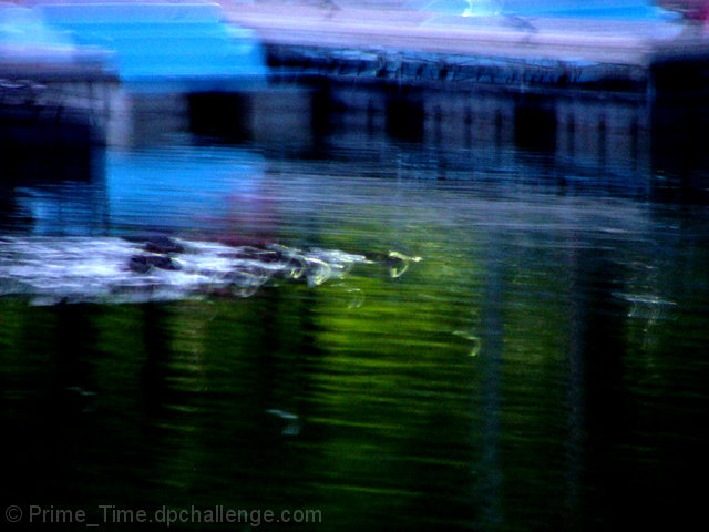
This would have scored higher in my opinion if the focus was a bit sharper. I find it hard to tell what I am looking at. The colors look like they could be nice.
Interesting abstract. The shapes and colours work quite well, but the noise is very distracting. I think you could have applied NeatImage or similar without losing any of the image's quality, since it works without sharpness. 7.
It reminds me of a poem by e.e.cummings. Sorry, I can't find it anymore. PM me if you want me to mail it.
Very impressionistic. You probably aren't scoring very high with this image, as DPC voters tend to be very literalistic. I like the colors and the movement expressed in the image. I feel water and swimming - 8
I did vote this quite low the first round although I liked the colors alot. There doesn´t seem to be focus on anything specific and the swimmer is not clear enough to know what it is..bumping up a nodge..
I really cannot tell what is supposed to be swimming here. The image is just a blur to me - even the ledge in the background. Lookms like the colors would have been nice if not so blurry and noisy. Try using a tripod and timer if necessary.
this image is really out of focus and moved, the colors are all wrong and there is no way of telling what it is that's supposed to be swimming.
hope this image was put in this challenge for some other reason than to challenge other images, because I'm forced to give it my lowest score in this challenge, and the only one that gets a 1
I really like this image. I'm not sure what it is, but I love the colors. The only thing that is bothering me slightly is the relatively rough edges of the motion blur (I don't know if that was done in camera or in pp) in the top fifth of the image, particularly in the upper left. However, I still like the image very much.







 Add photograph to your favorites
 Add photographer to your favorites

 Photographer found comment helpful.


