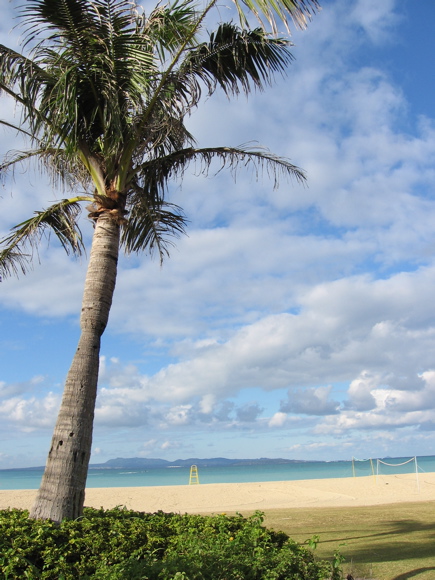
This is a nice composition. I like the perspective on the palm in the foreground and the interest in the sky. This would be improved by leveling the horizon. A little more contrast and saturation might also help a little.
A nice bland beach shot. I'm sure you had a lovely time at this place but the colors don't pop and the water is such a small sliver of the image it just doesn't convey Paradise to me.
You might try adjusting levels to enrich your colors. Also, square your image so that the sea is level. The palm's lean will be more dramatic and accurate.
This is a hard image to critique. There is nothing here to jump out and say wow! Its a nice picture to put in the album and say I was there, however here there is nothing special to show. The clouds are nice. Perhaps alittle closer to the water, showing the waves, the hills in the background and the clouds.
The tilted horizon bothers me a little but not much, other than that pretty good but I suspect it will get lost in this huge challenge as it´s fairly ordinary and nothing really that catches the eye. For what it´s worth this shot makes me wanna visit this location though :)
Every comment is going to say the same thing...so I wont, I'm sure you've made friends with the rotate tool by now. Otherwise, postcard material, and I mean that in a complimentary way.







 Add photograph to your favorites
 Add photographer to your favorites


 Photographer found comment helpful.


