When I saw this challenge, I couldn't resist entering this even though I did not have ANY original file with me (was overseas for 2 months.)
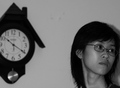
I really liked this image, but what I was hestatant about bringing it online was the filter (was done for my friend - she likes pastel effect) because in the rule, it clearly stated that filter would definitely generate really low score. With that in mind, I still really wanted to enter this just to hear what people feel about this image. After a weekend of thinking, I still decided to enter and grabbed what was on my website.
Gladly, besides that I risked my image with the unavoidable filter and size, I am really delighted to see that are quite a few people really loved my image. Thank you everyone, these days I have been working with several photographers and had great experience. Sorry that I haven't been able to keep up my portfolio with yours. I will see if I can come back online soon : )
I know what you were going for here, but it's just too blown out. When you go for these high key shots you have to be careful not to blow out the detais, which you did.
This looks like it could be great, but I can't really see anything as the shot is so small. Resizing to 640 would have helped with this. I also found the flare from the added contrast distracting.
Very emotive shot. I personally like it, but most shot's that have been processed to the point where they no longer look like a photograph don't do well here.
Nice concept, well titled, however the blown highlights really distract from the image. Also the picture is too small which makes it reall hard to see a great amount of detail. You should try to have your challenge entries as close to the maximum allowed size as possible -- "File Size: No larger than 150 KB (153,600 bytes). Dimension: No dimension may be shorter than 160 pixels or longer than 640 pixels."-- your dimensioins are 128,826 bytes and 325 x 431 pixels.
After studying your photo for a few moments, I get a sense of "seeing the light" after death. Intersting. I think the whites are a bit overdone, and the crosshatching has made this more of an illustration now rather than a photo, but if I "get it" I do like your concept and creativity.
A nice concept, but I'm not thrilled about the processing. The over-exposure and high-contrast doesn't really work for me in this case, and the smaller image doesn't help.
Great work on heavens door! I really like it alot... Some may think of it as a art rather then photography and thats true... (photodesign) But that shows even more creativity.. IMHO in this case...
9 and in my fav... Good luck






 Add photograph to your favorites
 Add photographer to your favorites


 Photographer found comment helpful.


