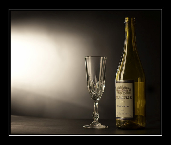
I think this should have ranked much higher than 166th. I can't find anything wrong with this image. The lighting and use of space is spectacular. Maybe the subject wasn't interesting enough for the voters. I gave it a 10.
Nice composition and light. Would have been much better with some wine in the glass and the bottle. As it is it is a bit boring to look at. All this just imo, obviously. Good luck!
Nicely composed picture, very inviting. In my opinion the lighting on the background could be just a tad softer, as it is, it draws my attention away from the subject. The border seems to work well with this picture. Nice capture
I love the set-up.. the lighting on the glass and bottle are nice (except for the weird refelctions in the back of the bottle), but that blow out.. just a little too much.
A very elegant clear crisp image
Love the tones and a really professional looking capture
I don't know if it will win but it should rate hightly because it Is a good photograph
Technically, this is almost excellent - the brand name isn't quite clear enough, especially with the glare in the middle. I like the black/white background; the bright area is perfect for the brand's tagline in an advertisement.
Lovely product shot. One little thing I would recommend on a shot like this is either having some wine in the glass and the remainder in the bottle, or having the empty glass and a full sealed bottle instead of an empty one.
One things for sure, an empty bottle was a good one. ;-) Cheers!
Now that's still-life done to perfection! Only tiny little nit-pick is that the innermost black frame is not evenly thick on all sides, it's a little thinner on the bottom.






 Add photograph to your favorites
 Add photographer to your favorites


 Photographer found comment helpful.


