Author Thread Comments Made During the Challenge
Post actions
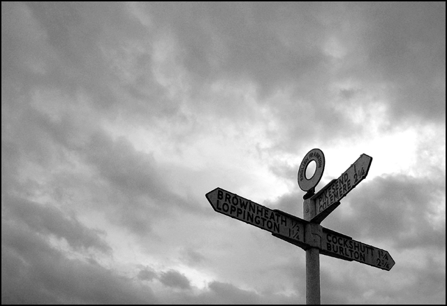
the signs are a little dark
Post actions
The sign itself could use more light, but I really like the way you've framed this shot.
Post actions
Nice composition... I like the angle and background clouds. The sign is a tad dark which makes it hard to read. Well done.
Post actions
Bumping this up one more. Good use of the rule of thirds, the sky is very gloomy looking, good focus, well composed. Good luck
Post actions
Perfect sky for this shot...would've preferred a little more light on the sign (fill flash). Still really cool.
Post actions
Post actions
Sharper contrast would be nice. IMHO
Post actions
I've noticed a difficulty with photographing signs. Even an otherwise good photo can be detracted from by having an irrelevant sign in it. You solve this problem by making the sign difficult to read. The viewer knows it's a location sign, and that's all he needs to know.





 Add photograph to your favorites
 Add photographer to your favorites


 Photographer found comment helpful.


