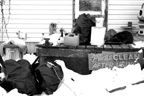
Personally I find this photo hilariously ironic and mundane. Its the sign thats been on my mum's front deck for years. And yup, it always looks like this. Though in the summertime there's less snow ... DOes the photo have any redeeming qualities? You tell me.
Statistics
Place: 129 out of 186 Avg (all users): 4.9786 Avg (commenters): 5.5000 Avg (participants): 4.7640 Avg (non-participants): 5.1103 Views since voting: 778 Views during voting: 300 Votes: 234 Comments: 8 Favorites: 0
I'd still like to know where the sign came from before I found it in the bushes. And now that I can actually see it from closer than ten feet at your house, the whites are crazy harsh. And the deck has looked a helluva lot worse than that you know.
Whites are extremebly blown out, kind of hurts to look at them. I do like the stark black and white. The composition is lacking...overall it just looks like a boring mess.
Love the concept. The shoot is very hot however and much of the detail is lost. Maybe next time set up the exposrue on the brighter areas or try some bracketing to get choices.
Well, people really read that sign huh? I take it the sign is trash too? Nice subject for the theme, contrast is very high, some people may think too high.






 Add photograph to your favorites
 Add photographer to your favorites


