I like the lighting here. The soft gray shadows add "color" to an otherwise monochrome image. This approach to the Round challenge is a reminder that roundness is a matter of perspective.
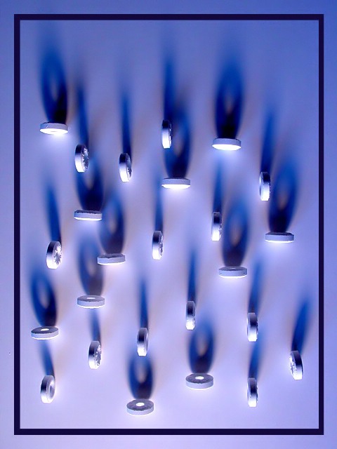
Certainly one of the more intersting shots this week. I really like the color gradient of the background between the top and bottom. I think a shot like this does need some sort of border, but this particular border seems to take it a bit too far.
A truly original idea! Took much more time looking at this one, than the others. Maybe some people will find the colors strange, but I like it as it is, hope to see it among the highest pics. 9
very neat! At first I was trying to figure out if this arrangement meant anything, or was in some special code, but then I gave up my aspirations of John Nash and just admired the use of light and shadow to create a feeling of round times two!
This is a very unique idea, and I think you've pulled it off beautifully. The lighting is the best part, I really like the effect created by the "saver's" shadows.
The shadows, blue tones, and composition, nicely work together to create an interesting image. It certainly causes me to want to 'keep looking' just as a good shot should. The composition seems to be random yet maintaining a degree of symmetry. Inviting and enjoyable capture, nice job.
clever compositon but the blank area at the top is distracting to me....the crop I guess is why it looks this way. Your light is nice, I just think you tried to include too many for this to really work.
Very neat! I like it alot. Although, and I'm sure others have point this out.... -points to small crumb outside of boarder on left hand side- That's okay. It'll get spot edited out if you offer prints right? At any rate, it adds character. :)





 Add photograph to your favorites
 Add photographer to your favorites

 Photographer found comment helpful.


