Author Thread Comments Made During the Challenge
Post actions
Post actions
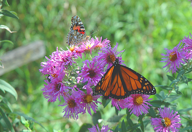
Pretty shot, but the focus appears a bit soft and "foggy" looking.
Post actions
Post actions
nice capture, good color, crop needs work, brightness seem muddy, nice dof, blacks good, whites need work, comp ok, angle nice, overall ok
Post actions
Your blacks look washed out - use levels or curves to make the black tones even darker. 6.
Post actions
Nice image, but what is the soft grey shadow/mark near the edge, at the middle left-hand side as it distract me from the butterflies.
Post actions
Post actions
very nice..i like the orange of the monarch
Post actions
Nice picture. Cropping would have helped a lot here. 6
Post actions
This photo is crying for more contrast. There seems to be a haze over it.
Post actions
This is a good photo but could be great if you crop much tighter increase contrast and saturation and sharpen.
Post actions
blacks need to be a bit more black...
Post actions
I think an Auto Levels adjustment in Photoshop or the equivalent would have really improved this image. The lower part of the tonal range is completely unused, making the photo look washed out.
Post actions
I think in this shot the colours look a bit washed out. Increasing contrast and lowering the brightness just slightly should help give the colours in the shot more vibrancy :)
Post actions
Imagining this as a square with the left cut off. Would bring the subjects up as well.







 Add photograph to your favorites
 Add photographer to your favorites


 Photographer found comment helpful.


