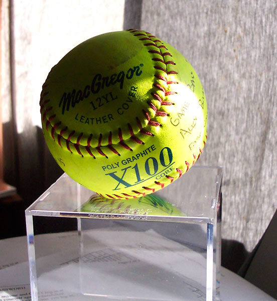
The setting needs more thought....ie: a plain and nutral coloured 'floor', the same for the background(or perhaps an unfocused baseball poster), more even lighting (the shaddows are too dark and the flare should have been removed).
The window in the back is rather distracting... I like the way the light falls on the wording though, it makes whatever it says seem all that more intriguing. I think I would have rather had this in a studio setting, or at least with a solid background. The papers that are underneath it are kind of bothersome as well.







 Add photograph to your favorites
 Add photographer to your favorites


 Photographer found comment helpful.


