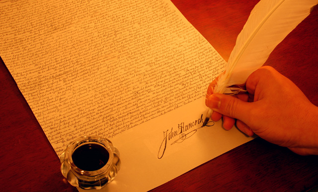
It won't take too much to make a case that the declaration of independence was in fact more an economic rather than a political doctrine. The color toning here doesn't gel for me, with the reddish tinge on the hand seeming very out of place. White balance corrections are in order perhaps...
I had the same idea (John Hancock's signiture), but entered the Road contest instead. So needless to say, I like your idea. I think it would be better if the white balance was correct.
Nice idea, and pretty good execution. Overall image seems too yellow, whiter pen would be better, and desaturate for an older instead of yellower feeling.
Very clever picture. Technically, it's perfect: great focus and sharpness, warm colors, perfect compostion. Not a thing wrong with this one: excellent job.







 Add photograph to your favorites
 Add photographer to your favorites


 Photographer found comment helpful.

