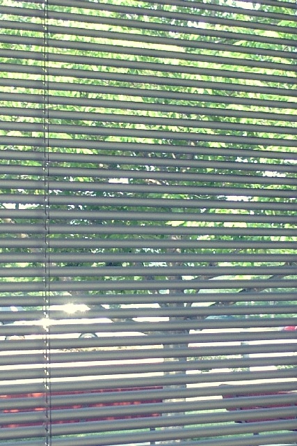
The very middle-grey color of the blinds in this shot I think brings the overall effectiveness down -- pulling the vivid color of the background closer to very bland tones. This is surely largely because of the material of the shades, but I think maybe playing with different lighting coming from either in front of or behind the shades might have given you a better color... either lighter and more transparent or a little darker, emphasizing the contrast.
Neat idea, certainly a different interpretation of the theme. I would have liked to have seen this shot earlier or later so the glare off the car wasn't as harsh.
The glare of the car outside is a bit distracting. Also, I would have tried to increase the color saturation a bit. As it is, the image is dull colorwise. I don't feel that the subject is that strong either, but more color may have helped it some.
Sorry, but I disagree with this interpretation. (Unless you really meant the window as the transparent object, but the blinds are opaque.) Sun glare on the white car is highly distractive. Photo 3 Transparency 4 total 4 swash






 Add photograph to your favorites
 Add photographer to your favorites


