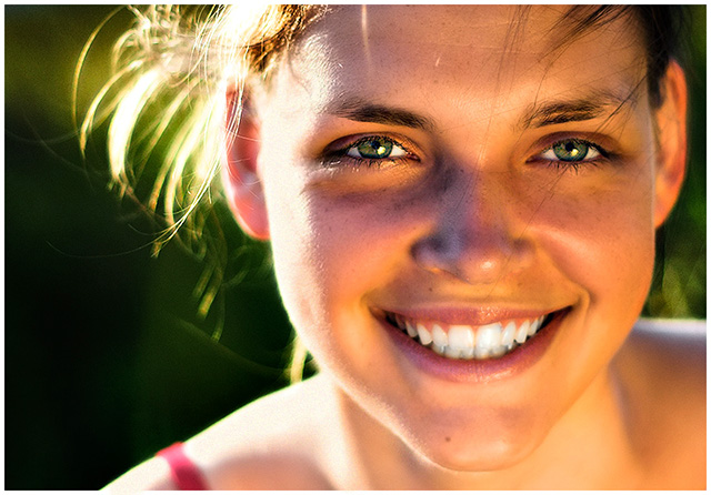
Nice expression and tones. However, the light on the face is coming up from the bottom. When you light someones face you really should be at least level with their face, but it is better to be higher then the face. Then you don't get shadows under the eyes or light the bottom of the nose.
A classic portrait. I love the warmth of the natural light you used to illuminate this shot. However, on my monitor (which is calbrated) the glow around her mouth and cheeks is a little too much. If you added saturation or glow in PP then I think you went a little too far. If not, then I think you need to check your camera settings. :) Still, it's a great shot, and in my top tier for this competitive challenge.
Excellent lighing, but you lost some focus on the lower half of the face, it seems. It's good the eyes are spot on focus though. I like how the background matches her eyes. 9.
I think you might have desaturated the teeth a bit- you have clumps of grey. A trick I use (and you might have even used it!) is to desauturate only the yellow hues. I remember seeing this before & still think it's a remarkable portrait! :0)
What a vibrant, expressive face. Her personality radiates from this photo. The lighting may be a little harsh on the left side near her temple, but you almost don't notice because she is so beautiful and her smile draws you away from everything else but her.
I've seen some versions of this pic before. Liked it then, like it now! Fun picture! One criticism would be that the teeth are looking a little blue, but that's about it.






 Add photograph to your favorites
 Add photographer to your favorites


 Photographer found comment helpful.


