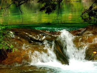
I like this as an abstract, but I think it might have been better with a tighter crop to emphasize the abstract instead of trying to show the surroundings. Also, it would have been better if you had posted it larger.
Too small of an image to really be able to judge the quality of the photo. There is a tutorial on DPC to help contestants maximize image size for contest photos.
The photo has a very bright hot spot on th bottom right that I find to be very distracting. I'm not sure of the weather conditions this was taken in, but if it wasn't an overcast day, you might find that helpful in reducing the brightness, allowing you to take a long shutter without getting a hot spot. JMO.
please read the tutorial for preparing images for challenges. you have no doubt lost a lot of votes due to your image size. as best i can tell, this would have scored a LOT higher if the image had been larger. don't be discouraged, and DON'T QUIT! better luck next time.
The small size of this photo looks like it really does not do it justice. I think it would benefit greatly from using the full 640 pix size allowed. There is a great tutorial in the learn section here on sizing photos for challenges. I'm sure the size here is hindering your score pretty strongly.
I wish this were larger - it looks like it would be very pretty. (There's a tutorial for sizing images in the help section or you can ask for help in the forums.) Good luck!





 Add photograph to your favorites
 Add photographer to your favorites


