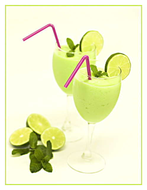
Greetings from the Critique club. After spending some time looking at the challenge entry. I am brought to a few thoughts I am going to put forward for you. I love the colors of this entry. The purple and green go really well together. It has wonderful composition and the border works really well. Nicely done.
I do have concerns that in reference to the challenge, they appear to be drinks, although by reading the description I'm sure they can be either/or, or both. The photo seems overexposed/blown out in areas. Making the glass stems disappear at some points and all together in others. The shallow DOF with the focus on the front straw takes away a bit. Perhaps the same shot done at f9 or so, would have made more focus then added gaussian blur to make the effect that you want. I think you actually scored real well for the challenge and a pretty nice finish. Well done.
Love the red/fuschia straws to offset the green drink. Unfortunately, I feel like the classes are leaning to the right a bit. Not sure if it's the crop or an optical illusion.
Good use of themed color in a well thought out arrangement. Good perspective. The contast is a little weak for showing the shape of the glasses and the focus is on the soft side.
Avocado smoothies! Haha, just kiddin. Looks yummy although it's hard to wrap my mind around summer right now. I would maybe consider a pure white background to the pale yellow you have going - just an idea.
Lovely coloring and light!! Creative idea for a shot as well :-) The glass in the front seems to be slanted a bit to the right, but that's my only nitpick!
I would really like this shot if the glasses wouldn't get lost in the background, maybe a little more contrast there would help! The purple straws add great contrast to the green...great shot!
Nice idea and nice composition and nice restricted colour palette. Could really do with straightening - might be a case of shooting from a slightly different angle. Also, there's a real loss of detail in the glass stems which practically disappear into the background.
A little over exposed and no real point of focus ( I think its on the front straw but not too much ), like the set up but could be improved with about a 15 degree CCW rotation.





 Add photograph to your favorites
 Add photographer to your favorites

 Photographer found comment helpful.


