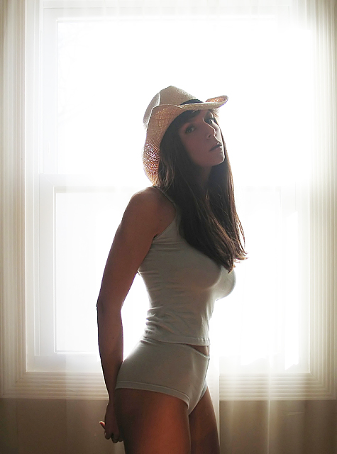
Nice technique, feathery fill lighting, wether bounced or augmented it works well. The framing is nice the rigidity and centerness of the window sets up the curves of the model. The color with the exception of the over red thigh,( incandecet bulb as fill? try using a full spectrum bulb if so, you wont get the orange tone to the light) is nicely handled.
How this fared so poorly is beyond me. Had you replaced this beautiful woman with a fresh bell pepper you would have garnered many fewer votes below five, but some subjects blind certain viewers to the quality of a shot.
it would be interesting to have a mode on DPC so you can see how these "1" voters vote on other challenges... not necessary to identify who they are, just how they voted on other challenges...
I am blown away by the people who dish out 1's so easily, this deserved better, you can disagree with a subject matter, or style, but at least give someone credit for meeting the challenge topic, photogrpahic technique, etc. I was also victim to quite a few ones and twos on this challenge. I think you did a fine job on this photo.
How could this picture get 12 1's? Looks like there are some haters out there. 1's are for out of focus pictures that don't meet the challenge.
Without them this would have scored in the 6 range and finished much higher. Congratulations Napalm on a great picture.
Wonderful picture, but the uneven lighting in the back keeps catching my eye. A different crop might work really well, with none of the window frame on the sides.
:-O Well, that's a mighteee purdy cowgirl if ah ever done seen one! Looks like a Nymph ;)
Very, very nice. Great job with the light coming through the window not turning the stunning model into a silhouette. Centered composition works well because she draws you into the image. This should score very well. Good luck and thanks for sharing. My only 10. I will be very disapointed if this doesn't ribbon.
This is a great photo...looking at the model...she makes me wish I didn't have that "crispy-orange chicken" from Applebee's after I spent 3 hours working out today!!! :(
Great work!!! 10's 4U!! (a few more jogged miles for me)
Great model. I think a tighter crop from the hipline up and very close on the sides would produce a more dramatic effect and eliminate the distraction of the window frame and sill. IMHO
I hate the hat, but absolutely love the rest of the picture. Great job of backlighting, and not loosing the detail in the forground. You might have even been able to go a little darker, but this is a very nice image. <9>
Downright sexy and mweting and exceeding the challenge. I would have experimented with different placements of subject in the frame and yet I realize that the center (as is) is probably the best because it reduces the exhibition of the backlight glare. In other words if you shit subject left then a mass of of the glare will be in the viewers face. A very good effort because adequate lighting depicts the form. 7 on my first pass.
Well, she certainly is easy on the eyes... this was the first image that came up when I started voting on this challenge. Hopefully the rest will be this pleasing! :)






 Add photograph to your favorites
 Add photographer to your favorites


 Photographer found comment helpful.


