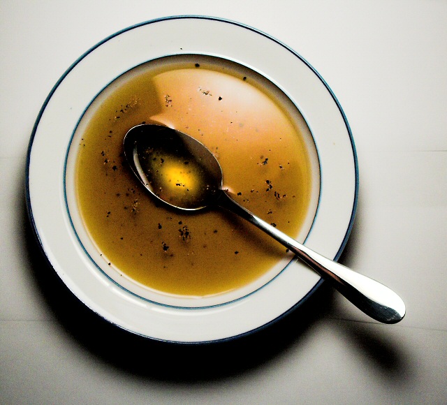
Well composed image. Being taken from directly overhead wworks well. Spoon placement and angle is good. The lines behind the bowl will be a slight distraction for some viewers and you might consider applying some light noise reduction.
Very good use of light to give the transparent look of clear soup. The use of the spoon to catch more light further enhances the kind of food you are depicting here. Good use of materials.
A difficult lighting problem has been mostly overcome resulting in an attractive compositionespecially with white on white. The major detractor is the line across the lower part.
Challenge
- Relevant to the Challenge? Yes
- Is subject unique (vs. unoriginal or rehashed)? Yes
Compostion
- Good or Bad? How can it be fixed? The lines on the table are a bit distracting, however the one under the spoon has a nice shadow effect going for it. More texture under the bowl or less? I can't decide. I like that the bowl is slightly off-center and out-of-frame with the diagonal pointing spoon.
- Good use of Depth of Field? Yes. The whole image is nicely sharp.
Lighting
- Good use of light? Yes and no. I love the shadows, but the reflection in the bowl gives me fits. "I like it. It's too much." The handle of the spoon is blown out though so I ultimately have to go with soften the light a little.
Aesthetics/Artistic Appeal:
- What is my reaction or feelings? A well done shot. I keep looking into the reflection in the spoon and begin to daydream. Good work.
Nice top-down view - really shows off the colour and pepper corn in the soup broth. Lighting seems a bit harsh - I'm not sure I like the reflection at the top area of the liquid and the shadows are quite harsh too for my taste.
shame about the lines ( white card used I presume as a under plate back ground) near the bottom right of the spoon handle. Otherwise Nice and I like the grain in the image - works well
It's a good picture, but it lacks a bit of compostition for me. I think you're spot on on lighting, but the presentation compared to others was not as attractive and appealing to me. It could be because of the low contrasting colours. So say if you could have a different colour ceramic bowl, it would have contrasted much better with the white background. I'm not sure what the background is, but the lines distract me a bit from the centre piece. It's a certainly good drawn in though. I gave this a 5.





 Add photograph to your favorites
 Add photographer to your favorites

 Photographer found comment helpful.


