Author Thread Comments Made During the Challenge
Post actions
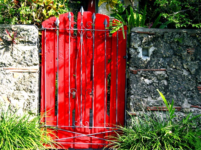
Nice lighting. Teriffic subject. Maybe too close in or have wall "lead" to subject door would give more meaning to photo.
Post actions
I like the saturated colours; did you take the white balance from the shadows?
Post actions
I love this photo! I like the contrast of the sun and shade.
Post actions
Good job, nice composition, great colors. I would have tried to straighten it a bit, but it might actually be straight for all I know.
Post actions
I think in theory this shouldn't have worked quite as well as it did. The saturated colour of the gate works nicely against everything else's muted colours.
Post actions
Warm, welcoming and unexpected. Really has punch.
Post actions
Great subject, great light
Post actions
a good pic i cannot pinpoint what makes it so but as a whole it inspires emotion which for me is the goal of a pic well done
Post actions
Would be nice if it was level and better framed.
Post actions
I like the contrast in colors here.
Post actions
I like the subject and the framing is good, but the wall to the left of the gate is pretty overexposed. If it had matched the exposure of the wall to the right, I would have given the shot a 10
Post actions
now someone understands the challenge. Make red the focal point! Bravo.
Post actions
Are they lead to the hell of paradise?
Post actions
I like the symbolism - red means stop; the wrought iron bars over the door. Well done.
Post actions
overexposed on the left and too much shadow on the right.
Post actions
Post actions
I find the front left of the photo to be a bit bright.
Post actions
darken the exposure a bit and this would be really eye-catching
Post actions
I like the saturated colours; did you take the white balance from the shadows?
Post actions
I love this photo! I like the contrast of the sun and shade.
Post actions
Good job, nice composition, great colors. I would have tried to straighten it a bit, but it might actually be straight for all I know.
Post actions
Nice lighting. Teriffic subject. Maybe too close in or have wall "lead" to subject door would give more meaning to photo.





 Add photograph to your favorites
 Add photographer to your favorites


