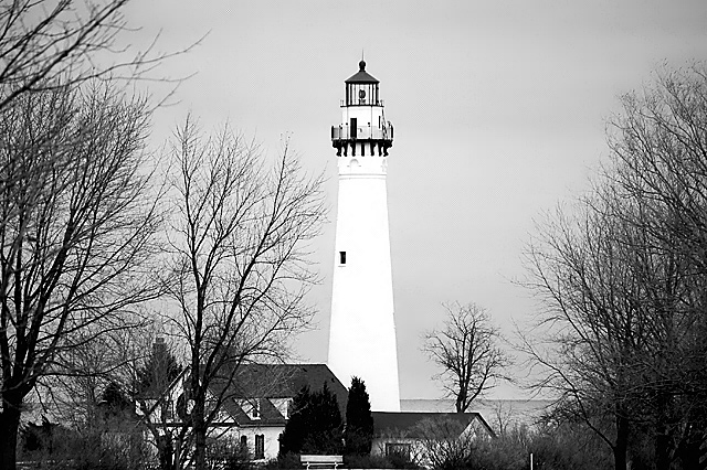
nice idea, b&w need desperate help, your tonal values are off, textured whites and textured blacks are what you are after, nice comp, good dof, light ok, overall a nice try
I think this could have been a better shot if you had composed the lighthouse tower off center (probably to the right to allow for the house on the left). Off center subjects are almost always more pleasing to the eye and brain then dead center.
beautiful. I love the pure white of the light. Which great lake are you on the shore of? Cheers from the west side of Superior. (well, somewhat near the west side...)
If anything, I would like to see this without the tree to the immediate left of the lighthouse, as I feel that it mars the composition somewhat. A bit too much to ask for, I know.
Lighthouse seems too white. Composition might be enhanced by cropping vertically with less stuff to either side of lighthouse but not centering the lighthouse.






 Add photograph to your favorites
 Add photographer to your favorites


 Photographer found comment helpful.


