hey commando303 other members have much appreciated than you because nobody had questioned like you as u said that you are not able to find in the picture who is poor and who is rich... but all of them had accecpted that only quality of picture is not good but they understand the concept and appreciated well so they guys are not like you, they wrote every thing honestly but u commented delibrately..text
Well, I guess it wasn't just I who commented that your image is less than stellar. So, did you mouth off to everyone whom you could PM? You need to grow up.
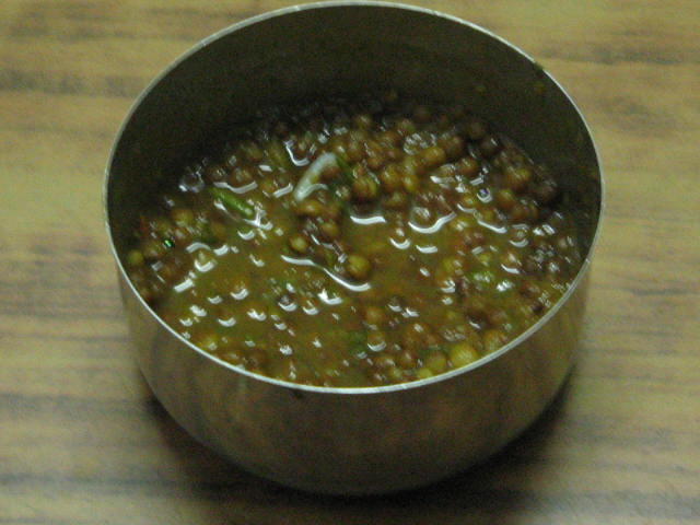
it seems delicious born apetite. i love indian food im im not wrong this is homely made daal. Very awesome presentation. i like it. gud job keep it up
10
This image is not overexposed and the green color tones are fine but the overall image quality is not partcularly good. It is taken from an ordinary perspective and the focus is off, especially on the soup where it matters most.
I'm sorry to say this, but this will finish very low. It's grainy, out of focus, and very centred (dpc voters generally dislike centred subjects). I guess this is one of your first entries to a challenge. Keep trying - learn the ins and outs of your camera, work with light and learn about composition.
Very interesting dish!! I've really enjoyed seeing different cultures represented in this challenge :-) It seems as though your focus is somewhat off, and there appears to be a good deal of noise/pixelation in the image. Looks like some very interesting ingredients and colors in this dish!
This is going to score bad... the composition is boring. It ain't sharp. The dish looks like puke (no offence) and it ain't nice presented. Colors aren't tastefull either.
This probably tastes great, unfortunately it doesn't look it. I would say the two main areas this shot could be improved would be;
- the focus needs to be sharper
- the colours need to be more vibrant.
Due to these point the image as a whole appears flat and unalive.
The focus is poor. Should you reshoot this, also consider changing the background color or else adjusting the white balance on the camera for the lighting.
Eewww. Not the daal, the photo. No offense, but why did you submit this? Assuming you were sincere in your submission, here's a critique: there's significant camera-shake, the choice of framing if unappealing and poor, the white balance is way off...it's just a really bad shot. Sorry if this is harsh, but, well...come on. I can't even give you a higher grade based on bias as a result of its being Indian. Really, try harder next time.
Honestly, when I saw this thumbnail, I said to myself I'd probably be giving this a 6 or 7. No offense, but once I enlarged it, it was such a big disappointment to me. The quality itself isn't very great, blurry so to speak. The set up is not so great. I gave this a 4, so I thought it deserved an explanation rather then just giving a low score and you not knowing why.
The colour contrast in the food is not great. Usually, for me top view doesn't work well. So if you could have placed somewhere else except in the centre, and given it a more side view and a few enhancements it might have faired a lot better.





 Add photograph to your favorites
 Add photographer to your favorites

 Photographer found comment helpful.


