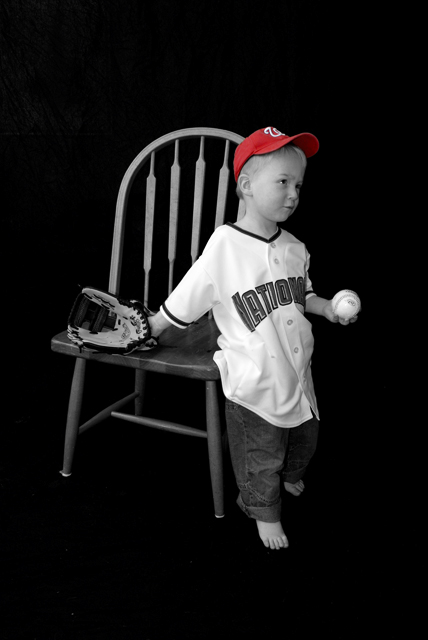
Greetings from the Critique club. After reviewing your photo I have some thoughts I'd like to share. Beautiful focus, and wonderfully composed shot. Only thing I might change as an after thought would have been the angle of his head. Maybe turn a bit toward the camera. I like the background and I think centering works well. Selective desaturation makes this a nice portrait. But I dont think it makes it a burst as it needs for the challenge. I think it scored really well, and the models parents would surely love this as a print. As a dad I know I would. The shirt does have a few spots that are a bit too bright for my taste, but its not too bad. Overall a pretty good job.
I like the contrast in the B&W portion of the image, but the selective desaturation seems to have been done because it was possible rather than because it improved the image.
Cute photo and nice use of selective desat. IMHO I'm not a fan of the black backdrop used here. It seems to create a formal potraiture feel to a seemingly candid moment. Just my opinion, nice shot nonetheless
I would like this better if Nat were looking at the viewer instead of looking out of the frame. I hate selective desaturation and in this case it appears to be used simply to fit this photo to the challenge. IMO the burst of color should be the focal point. In this case,the red cap shouldn't be the focal point of a studio portrait.
Nice selective desat and nice background. Would have been fun if the name on the shirt were red, too. I like away from camera look your boy has, but it leaves me wondering where he is about to go. I guess out to play since that is an indoor chair.
I like this shot a lot (even though the chair looks like it is floating!) However, for this challenge the subject was supposed to be set apart from the rest by color, which would make the cap the subject and I don't think that is what you intended.






 Add photograph to your favorites
 Add photographer to your favorites


 Photographer found comment helpful.


