First, some photographer's comment would be helpful in the future.
Challenge
- Relevant to the Challenge? Yes
- Is subject unique (vs. unoriginal or rehashed)? Yes and funny too.
Compostion
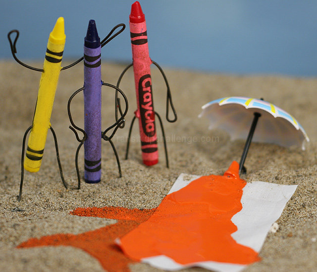
- Good or Bad? How can it be fixed? Good. I assume that the blue background represents water?
- Good use of Depth of Field? I would widen the DOF a stop the based of your crayons are a little soft.
Lighting
- Good use of light? Yes
- Good use of shadows? Yes
Aesthetics/Artistic Appeal:
- Colors and Contrast. I don't care for the shade of blue in the background I detracts from the Burst of Color of the crayons.
- Sharpness. Needs a little work.
- What is my reaction or feelings? It's funny at first, but then you start to see the details. Something white under the right edge of the 'towel'. The bits of torn paper on the crayons. The lack of sharpness to the crayons.
Cute... most orriginal. It is also well executed to boot. The only constructive thing I can think to add would be a wider DoF. This is personal taste, but since there isn't much background to distract, I think it would add a crispness without distracting. Well done.
Only Yellow appears to be upset by this tragic mishap. Blue seems peeved but not overly concerned over the fate of poor Orange and Red is standing off in the background rubbernecking. I like that there is stil a bit of head left on Orange--it's rather unsettling and gory in a whimsical sort of way.
Clever. I love the way you made the crayons into little people! The dof seems just a bit too shallow, since you can clearly see a line of sand that is perfectly focused. I also might like to have seen this a bit more brightly lit, since the idea is that the orange guy melted in the sun. Extra points for creativity and setup!






 Add photograph to your favorites
 Add photographer to your favorites

 Photographer found comment helpful.


