Hello Bethan, from the world famous Critique Club.
I will have to rate this image very high indeed, because not only do you & I share the same name (not Bethan ... the other part)), but also you took this: and I took this: We must be cousins.
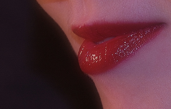
Actually, I do like it a little more than the voters did. The composition is very good, and the idea to zero in on such an iconic Burst of Colour was a worthwhile one. That's the origin of the practice of wearing lipstick; as a deliberate burst of colour to attract a certain kind of attention.
I guess the problem was what some of your commentators identified as poor focus. Actually it almost certainly wasn't poor focus in the camera sense; it was more likely that the shutter speed was so slow that a tiny movement of the subject was unavoidable. But the problem with an image such as this is that it really MUST be all about perfect execution. It is really a graphic art image, and so the smallest technical (graphic) weakness will sink it. Which was a pity, because this was potentially otherwise a much better photograph than the score it attracted suggested. I think a much faster shutter speed and therefore a wider aperture may have helped, although that does introduce shallow depth of field challenges (no big deal when you have a controllable "studio" setup in the basement ... you can take your time and also shoot a hundred shots to get it absolutely perfect). A terrific idea, though. If you can bear to do it again, I'd like to see it.
Cheers,
Paul
Oh this is so interesting, the only thing I would have done is remove a little red so the skin looked whiter the lips are just so good I can understand you would be hesitent to do that. Great image composition too.
Nice take on the challenge. I like the composition and black background here. The lighting looks a little on the cool side with some shadowing apparent. Just my humble opinion, nice shot nonetheless







 Add photograph to your favorites
 Add photographer to your favorites


 Photographer found comment helpful.


