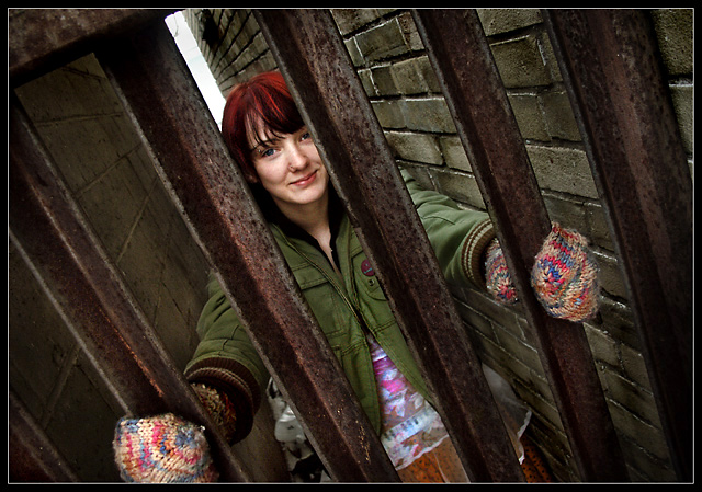
Fine compositino and used of the earthtones all about the model to make her stand out. Wish the jacket was not so drab, guess it was a bit to cold to have her remove it a moment and see her very colorful top under the jacket. Might have been more effective burst-wise. Looks like someone's favorite muse but I cannot imagine who.
I like her "mona-lisa" like smile and the angle of the photo. Compared to other entries, the colors don't burst off the screen as much, but technically, this is a good image.
I don't think this is a right representation of the challenge. Did you even try to make it fit? In any other challenge I would've rated this a 10, but unfortunatly I'll have to rate this a 0.
I love the perspective and the clarity. The tilt suits the image too. All of the lines, both in the brick and the up and down of the bars is great duplicity, BUT to me, color was supposed to offset the subject. Maybe all of her colors are offsetting her from the rather drabness of the wall and metal columns but I took it to mean that maybe just one bright patch of color. I think if it were just her mittens, or just her hair that were more the focal colors, it might suit me more, although if I were just to see this NOT in a challenge, I'd rave on and on. OH, I just did. . . . . I'm still staring at it and it's growing on me. I think I see your point and the title kind of explains your intent. Ok, now that I've written a novelette... I'll vote. 8






 Add photograph to your favorites
 Add photographer to your favorites

 Photographer found comment helpful.


