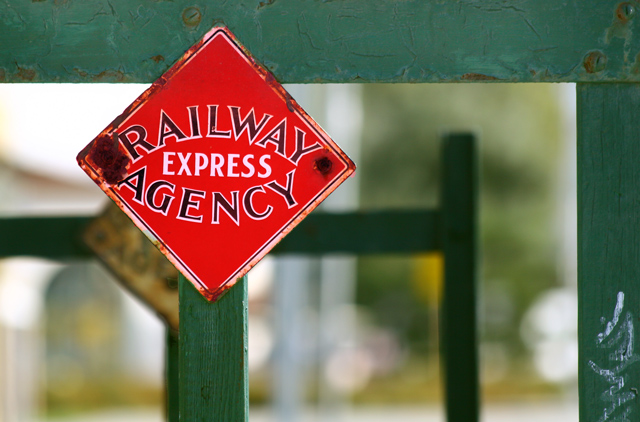
I like the red in contrast with the blue-grey. I also like the layers of pattern on the left side created by the different focus levels. The right of the frame is a bit weak for me---too much bright white competes with the pleasing harmony of the left of the frame. There are some really nice elements in this shot but overall it doesn't quite come together for me.
Nice use of color and Depth of Field. Your Horizontal and vertical lines all lead the eye to your subject (excpet one) and your rule of thirds placement aids the subject in holding the attention. The background yellow triange is a little distracting. Well done.





 Add photograph to your favorites
 Add photographer to your favorites


 Photographer found comment helpful.


