You are right in everything Alice!
"Rainbow" is my favorite rock band, so although I knew this won't be appreciated by voters I submitted. Image as you said is soft, and cropping not ideal. Entered just last moment, there was not enough time to think again.. but this is not the point, I mean it would be good to get a high score but it is also so nice to receive such useful comments and get experience! :)
Pascal! What do you know. I've drawn another of your images for a critique.
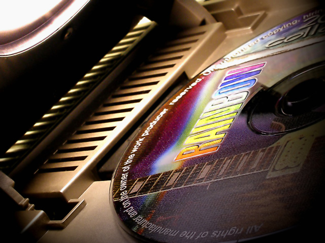
Well, this time you're not running off the edge of the earth into a blazing sun, you're looking for a Rainbow. It's a great idea, but execution may have been a problem for you.
It seems to me that there is quite a bit of information in this image and you might want to remove some of it to make the center of attraction more obvious and important. For example, that white space in the top left, is the brightest thing in the image and it draws the attention of the viewer - not what you want to have happen. And it adds little to the 'Burst of Color' theme.
I'd suggest cropping down quite a bit, still leaving some of the horizontal bars in the frame (to avoid the dreaded copying another person's art work rule) and perhaps cropping into the colored arc just a bit as well.
Finally, Pascal, I'd suggest using a tripod for this type of image. It is just a tiny bit soft, and you might think about how it would look tack-sharp.
Okay, that'll give you something to go on, and I'm delighted to see that you are enjoying DPC. Keep up the good work.
The color on the lettering seems a little washed out. Since that seems to be the intended subject I think that the composition is weakened by this fact. I think that a more minimalistic setting might have served you better here. The light source and whatever the perforated plastic thing is don't seem to add anything to the composition. Illuminating the disk's label against a black background with the light reflected off of the back of another CD would have had a much stronger impact.





 Add photograph to your favorites
 Add photographer to your favorites


 Photographer found comment helpful.


