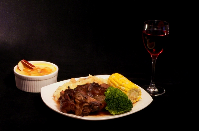
The whitish on the left side is spoiling it. I'd like it better if cropped to have more of the subjects in the image and less black background. even if it had cropped some of the dishes.
Bad title. For me the composition is a little wierd. What would have happened if the glass were moved between the two dishes? I think you would have gotten a tighter crop and a more prominent presentation. Also I do not like the lighting on the wine. 6
Good idea, especially the usage of a black background and the wine. The background would be best if it were uniformly black everywhere but grey shows up on the far left. Additional lighting to make the wine glass stand out more would be a good addition. The image seems a bit on the soft focused side when increasingly hungry reviewers want to see





 Add photograph to your favorites
 Add photographer to your favorites


 Photographer found comment helpful.


