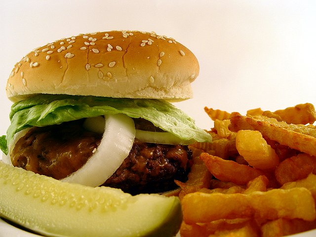
Love the title! Great focus and lighting - a tomato to add that splash of red would have made it even better IMO - looks like a Denny's ad - nice job :)
Well done composition with top notch focus. Overall, a very good image. There appears to be a slight brownish hue to the center of the "white" background and a greenish tinge to the burger and fries. White balance, maybe?
Good lighting, looks very tasty. Crop is just a bit too tight for my liking and the pickle in the foreground is not necessary for me. Good job, one of my top picks.
The fries are a bit too burnt for me, but I think it's a great set up, quite appealing even if I'm not a big fan of burgers. It gives a very home-made feeling to it, but maybe a bit too sloppy? The arrangement inside the burger could have been a be better (neater). The cucumber I can't figure out if it works for the picture or not. In one way it does, and then looking at it again it doesn't. I must say your lighting is very well done though. Doesn't have those hot spots that ruin the picture. I gave this a 7, since I thought the setup could have been immproved by a bit. Perhaps even a bit more colour to help on the contrast would have worked well as well.
Realistic approach, I like the arrangement, especially the skewed onion. You did a good job with DOF. My only suggestion would be that had you hollowed out the bun it would have snuggled down on the hamburger and looked less precarious.
Burger comes off as inviting, but its annoying that foreground is out of focus (the front of the pickle spear and the nearest french fry). It would have been better if they were rearranged to be in the focused field.





 Add photograph to your favorites
 Add photographer to your favorites

 Photographer found comment helpful.


