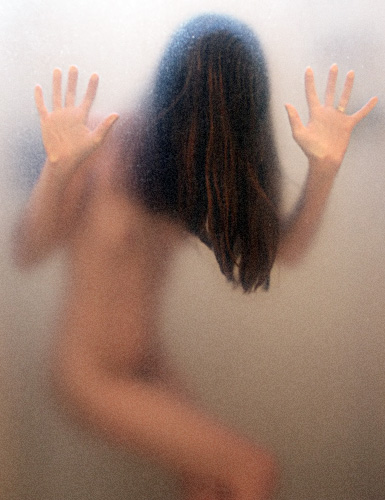
i love this photo... the lighting is wonderful, and the position of the model works well against the plexi-glass... an eerie and beautiful composition. -10
Composition
This composition is masterfully selected, cropped and presented for this challenge. I think that the image has too much whitespace in the bottom right side but it is inevitable as both the in focus left hand and the lines of the thigh are necessary components to this creation. The hands and hair being in focus provide a different interpretation of feminie nudity that almost forces a fresh perspective on the viewer by obfuscating the breasts and pubic area with the shower door. This image has a subtle undertone of lines contrasted against the otherwise blurred body of the model. For this reason the straight lines of the fingers, arms and thighs are important to this presentation but the lines shown in the hair yield the best contrast as they are in the largest focal point, amid the deepest colored section and show some of the longest straight edges in the composition.
Color
After copying this image into Photoshop and trying it in grayscale, I believe color is the best presentation format for this image as the depth of hues in the model's hair give multidimensional aspect to the focii that are most in-focus. The proximity of the colors in this image present another problem if its moved into grayscale; white balance becomes an issue. The absence of any color other than the model's natural colors and the light colored background help the viewer focus on the subject.
Lighting
Lighting is the one place where this picture might have a few problems for me. The diffusion caused by the intervening medium (shower door) yield a stronger power to the clear or white light especially at the top of the image where the light overpowers part of the model's head and causes the hands to washout of focus if put into grayscale (once again, why this color presentation works for me). I would like to see a variation of this image where the light source is redirected to a lower spot behind the model or where the light is diffused a little more at the top of the image.
Focus
The focus is fine in this photo; the hands (which are the least blurred by the shower door due to their immediate proximity with that medium) are in reasonable focus given the composition. I could stand to see the model's body a little closer to the intervening medium to bring it more into focus but I understand the artist's interpretation.
Overall
This image works for me and I feel that it is a fresh presentation of a nude, feminine form because of the focal point that the hands and hair lend to the image.
An image that speaks volumnes. It leaves me wondering what has happened to her. Neat how this follows along with "Unanswered Questions" as well as "Nude", as well as past challenges. If you have been at DPC for a while, this image shows everything you have learned. If you are an experienced photographer, new to the site or not, it still shows you have wrapped up all your knowledge in this shot.
Negative space is done well.. The use of shapes besides the figure... The drama and emotion so often non-existent in photographs.... the lighting...
congrats!
There is something in your pose that certainly conveys your title, it is a gripping photo. It looks like the subject is sliding down the shower wall. While you certainly fit the challenge topic, you have managed subjects ènudity to be secondary to the content of the photo, which in my opinion would not be easy to do. Very well done.
An old idea but a cool way of doing it. Except we have lost all contact with the model. I can't find a single point of the image that makes me bond with it - it does not communicate with me at all. ALso, teh grain in this image (it might just be that window, but it does look like digital grain) is rather radical.
not sure I like the clarity in the hair and hands. having her entirely obscured by the door may have worked better. As it stands, the hair seems to overpower the picture. nice contrasty bright spot up above - gives a high-key touch to it.
The composition is what makes this photo strong visually. It works. The use of the semi-see through glass is a nice idea. The brownish color nehind the glass at the bottom distracts me from the beauty of this shot. Overall, well done! 7






 Add photograph to your favorites
 Add photographer to your favorites

 Photographer found comment helpful.


