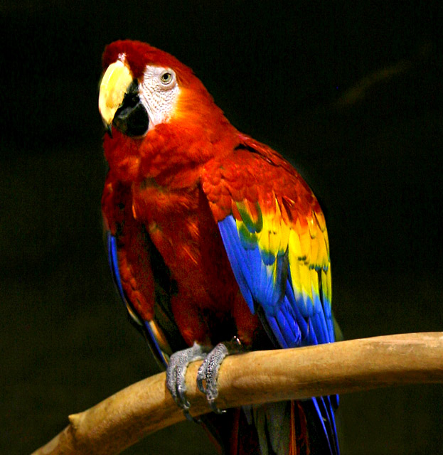
First Impression - the most important one: This is a good picture, I wish there was more to the background that could have framed the bird.
Composition: Not bad with an interesting DOF ... There seems to be some distortion where it looks like two layers met around the bird where some editing has taken place (I may be wrong but that is what it looked like).
Subject: I do like the colours ... and meets the challenge well. I would have liked to have seen the real background colour ... or a little more of it ... as the dark just seems a little unreal.
Technical (Colour and light): Nicely lit with reasonably good bold use of colour.
To grow its vote?: Well done, I think that taking note of the comments received ... which is funny as some say good focus and others say not focused, but try to look at the picture from others perspectives will allow you to grow scores and also see what others are seeing.
Summary: I think this is a good picture, weel executed with only minor if any issues .. not one of your best scoring, but you have done ok.
If you've got any questions about this critique, please feel free to contact me via the PM system.
Fun image. You have chosen a great subject, he fills the frame well, and he has good focus. I don't normally mind some image noise or "grain" but in your case, it distracts from the color's impact. I would check your ISO.
Nicely composed subject. The dark background really serves well to contrast the bright bird. IMHO the shot seems a tad soft in focus and also a little noisy. Perhaps post processing adjustments and use of Neat Image would have added to the photo? Just my opinion, nice shot nonetheless
the colours are good but the image is quite grainy. It also has an unnatural feel as well, probably caused by the manipulation of the light during editing.





 Add photograph to your favorites
 Add photographer to your favorites

 Photographer found comment helpful.


