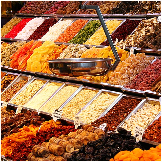
I wasn't sure about what "burst of color" should mean, but I was in a trip for New Year in Barcelona and I found this shop in the most famous market of this town: Boqueria.
Editing: levels, colours, hue/sat, USM, resize, USM, save for web.
Statistics
Place: 77 out of 244 Avg (all users): 5.7448 Avg (commenters): 5.7692 Avg (participants): 5.5614 Avg (non-participants): 5.9120 Views since voting: 1172 Views during voting: 361 Votes: 239 Comments: 16 Favorites: 0
First Impression - the most important one: Nice market shot with lots of different colors and textures.
Composition: Composition looks good. I might be interested to see the shot a little more angled, so that we get a longer view of the market stand. I also might suggest placing the shot so the scale is a little higher in the photo...it's rather close to the center right now.
Subject: Lots going on in this shot! Certainly plenty of colors. I like these marketplace shots quite a bit...they really give a feel of the place they're taken.
Technical (Colour, focus, and light): Colors look pretty good, though there seems to be a slight yellow tone to the photo (possibly because of lighting?) Focus looks pretty good too, though it seems a touch soft at the corners of the photo.
To grow its vote?: To grow the vote here, I would suggest really making sure that the focus is spot on. In this style of photo (which strikes me as somewhat photojournalistic) the focus can really make a huge impact. It's certainly not horrible, but the sharper the image, the better. I also think that composing the shot to remove the scale from the center of the photo would improve the score as well.
Summary: Lots to look at in this shot! Just a couple things to adjust and we're rockin' and rollin'!
Everything looks so freshly stocked and precariously balanced. There are definately a variety of colors here, but they seem mostly the same earthy tones, except for a few. Still, a fun shot that is well composed. Nice job!
So many interesting elements in this photo to make it interesting. I like the tonality of the shot and how you've included the scale as a focal point. The detail and focus look nice.... 7
excellent title - this feels like it has too much black in it - a little work in curves or levels to pull some black out would brighten this and make it a better photo to me - great eye, nice capture
"Use a colorful impact to offset your subject from the rest of the photograph" I think this is an excellent shot, but I do not think the subject is offset by the use of color.
I had a similar photo to this (except even more colorful because it was in a candy store) but decided not to submit it as it doesn't really fit the description. There is a difference between a colorful photo and "colorful impact to offset your subject from the rest of the photograph"
"Use a colorful impact to offset your subject from the rest of the photograph." In this case, the entire framer is the subject and nothing is being offset, by color or any other means. Nice shot, though :-)






 Add photograph to your favorites
 Add photographer to your favorites

 Photographer found comment helpful.


