This picture is great, and I'm so pleased to get a chance to comment on it further.
Colour, Composition and Contrast:
Nudes of women were abundant this challenge, I guess its hard to find a willing male model. Too bad for the girls, but I think your nude is one of the most interesting ones.
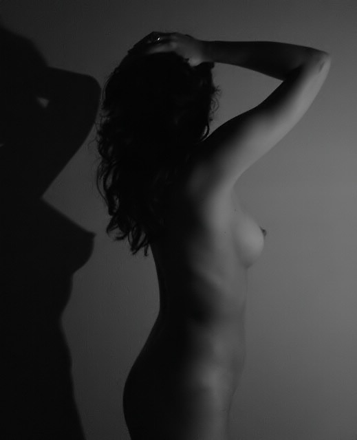
I like the portrait presentation and the shadow cut against the left side. The repetitive presentation really brings out the theme of the photograph and emphasizes her beautiful curves.
Though its beautiful as it is, one suggestion I offer is trying this same sort of a shot as a full body, or at least, more of her legs, I think with the shadow that would really have some impact. Also, have her take off her ring next time so it doesn't catch the light and reflect it back. Its a odd looking hotspot on her head that is distracting and can be easily avoided. Or you could just clone it out in post-processing.
I would also like to see a greater tonal range here. Basically, more whites and more blacks instead of the narrower range of greys you have currently.
I adore the choice of black and white and think it was the perfect one to make for this shot.
Focus and lighting:
Here is where most of your comments arose. There was a variety of ideas about the lighting and focus, but I think I agree most with the notion that the focus on the subject is just a tiny bit too soft. Its not bad, and I like the softness, but perhaps its the lack of contrast that make this look a little too soft. But as I said..its still very pleasing!
I agree with KevinRigg's comment about the lighting..its not wholly even down her whole body, and maybe an additional light to fill around her legs would have helped? Though I point this out, I don't think its a major flaw at all.
Overall:Fabulous shot and excellent placement in the challenge! I look forward to seeing more of your work. :)
Composition
This is a good idea with this subject. To expound, the subject\'s nipples and hair lend themselves to the lighting scenario selected. The nipples are promenent and make a presentation on the background. The subject\'s hair has body and, thus, doesn\'t lose its ability to add texture to the photo even though the lighting would normally cuase this feature to appear only as an outline. The angle of the subject also affords the artist a series of focus points to present to the viewer; to wit:the ring on the hand, the elbow and upper arm, the back of the shoulder, the breast, the ribcage (see comments on lighting).
Color
The color usage is a little confusing in that the tonal quality of the lower half of the subject\'s body presents more definition of the subject\'s features. The deep contrast between light and dark at the top of the photo lends itself more to conveying a message with stark differences than with subtle tones. The difference between the subject and the background or the subject and the shadow is good except between the ribcage and the navel. The front of the subject\'s body tends to blend a little with the background. Very good definition on the subject\'s back (especially in light of the proximity to the shadow -- The back is darker and mroe defined than the shadow).
Focus
The focus seems to have a sufficient depth of field to include both the model and the model\'s shadow.
Lighting
I\'ve alluded to this before but the lighting is inconsistent from the top to bottom of this photo. Either the deep contrast from the breast up or the softer tones from the ribcage down could tell a story but as this composition covers the whole area, I would expect to see a more consistent lighting scheme. The lower section of the shadow even seems to become blurred as opposed to the crisp definition seen between the shadow of the elbow and the darkness of the hair. I would like to see a more consistent edge to the shadow.
Overall
I like this pohoto. It has a central focal point but enough other items of interest so that a viewer should take some time to digest the whole image.
I like this composition quite a bit, especially with the tandem shadow... that works really nicely in this image. I understand your intention with the low key on this shot, but I think the overall impact of the shot could be even stronger with a greater overall tonal range in the image... This is still a very strong shot.. don't get me wrong :) The only thing I see here that I would have possibly 'fixed' would be the glimmer on the ring on the hand. It creates just a bit of sharp contrast in that part of the photo that doesn't really serve a specific purpose to me. Excellent work :)
Nice effect you created with the lighting and shadows. Is that a ring or something else on her hand? I find that to be a little distracting cause it stands out a lot. Other than that good work and good luck in the challenge.
Girlfriend.......with such a nice body you can come out of the shadow!! Well done, lovely shot. Good use of soft indirect light. Maybe a tight crop on the left Congrats.
hola cielo!!!!, al final me atreví a acabar tu votación, has visto lo que dicen algunos comentarios, bueno ya lo comentaremos luego. Por cierto aunque no pude mandarte postal de cumple creo que esta foto podría servir, no?. Te quiero!
beautiful subject. not so sure i like the lighting. the shadow interferes with the model a bit, both in it's proximity to her, and because it's so dark. softer lighting, or a little distance may solve both issues.
Ooh la la... nice use of light and dark, but what is that one white spot up by your hands? A wedding band, perhaps... If I could vote I'd give it a 10!
Good shadow work. This is good for black on black, but i would have liked a little bit more light in the highlights. As it is, the ring really draws considerable attention (which may have been you're desire, esp. if she's you or yours) but I think it is destracting. Really nice shot though!






 Add photograph to your favorites
 Add photographer to your favorites


 Photographer found comment helpful.


