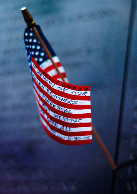
Not really that fond of the shallow DOF here, I would have liked this shot better if all of the text was in good focus. I like the colour tones in the shot.
first.. I'm not an American, and I'm against war so at this moment I really don't like the american flag..
but that aside, composition is bad, if the flagpole would stand straigt the image would be much better.
the text on the flag only damages the image, since I can't read it all then it shouldn't be reedable at all.
the focus is a bit off, and the DOF is way to shallow.
for a challenge like the best of 2005 you really should have had more ambition than to enter this image.
i am going to tell you good luck with this...i did a flag shot and scored horribly low (IMO)...i thought it was technically correct...but i guess not...9 from me...







 Add photograph to your favorites
 Add photographer to your favorites


 Photographer found comment helpful.


