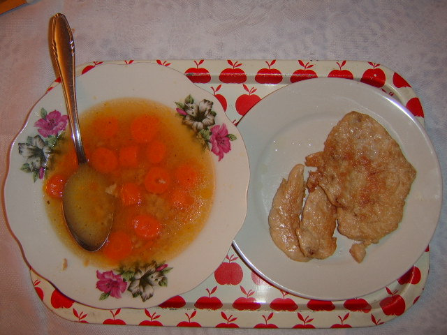
the lighting could be a bit better - there are lots of glares and the choice of platter and floral plate that don't match are a bit distracting as well as the object in the upper left hand corner - but it looks pretty yummy and I like your title :)
Sorry, but I really can't seem to like this picture. The lighting is way off, and it really goes against your food subject; with shots of food, the lighting should make things look apetizing, not bland. Also, the "directly-above-head" composition does little to make things exciting. The room at the top of the frame, too, is a strange choice. Sorry if this is a bit harsh; better luck next time.
The lighting is a little odd, resulting in dull tones. The choice of a plain plate w/ no garnish vs the colorful soup is unfortunate. And for me the spoon should be facing the viewer to "invite" us to eat. This way makes me feel "uninvited" (That's probably just me). 5
Un interesting angle and lousy lighting. No other word fits the lighting here, sorry to be so blunt. Flat, bad reflections/hot spots on the tray, one plate and the chicken. The chicken plate has some grease spots on it that look less than attractive. the soup bowl is too full (broth on the flowers) and there is some spilled on the bowl rim. There is discoloration (a reflection of some kind i suppose) on the far elft of the image that is not on the right. the top left of the image needs cropped more as some of the table is showing. the try is not stright with the bottom of the photo. There is more of that bad reddish reflection in the spoon handle as well.
Next time try more careful prep of the props, a better angle (look at most any food ad or menu) and read up on lighting - lighting is the most important thing.
Looking directly down on the food is a good perspective. Perhaps caused by the flash, but there appears to be vignetting on the corners of the image. The object in the upper left corner is a distraction and should be eliminated. The tray should be made level, being slightly crooked distracts the viewer. Unfortunately the tray reflects light from the flash and the spoon casts a sharp shadow. A bright, but diffused light source would work well with this composition.
Good old home meal... The meal looks nice but the composition of the pic is not that good. You have a distracting element on the left top + some glare)probably from the flashlight). good luck
Sorry, but this does not even look appetizing. Aside from that, the tray is crooked, and you can see the flash at the bottom of the tray by the chicken (is it chicken) plate. Also, the spoon cut off and the tops of the plates and tray being cut off give it a hurried feeling.






 Add photograph to your favorites
 Add photographer to your favorites


