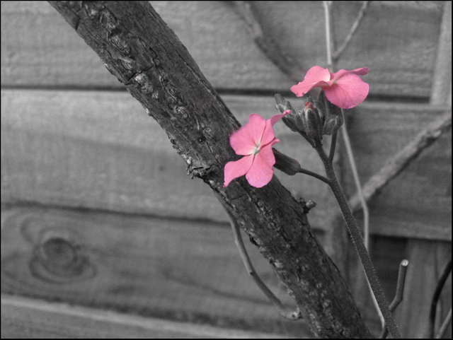
Maybe not the best, but definitely my favorite. This image, close to my heart, really got me interested in photography this year. . .It's strange how my favorite images tend to come from my p&s. . .
editing:
selective desaturation with hard round brush and hue/saturation
changed magenta hue/saturation
clonen and healed part of flower
brightness/contrast
border
Statistics
Place: 717 out of 833 Avg (all users): 4.9100 Avg (commenters): 5.0000 Avg (participants): 4.7861 Avg (non-participants): 5.4737 Views since voting: 923 Views during voting: 550 Votes: 422 Comments: 17 Favorites: 0
I like the subtle nature of this. Good use of selective desat. A little more sharpness on the flowers and a little less detail in the background might improve this a little.
not to big a fan of the parcail desat. in this image it works well with alot of other types of composition but i never have liked it much with flowers. would've liked to see the entire image in ritch color, like slide film rich.
personally i do not care for selective desaturation very much. i think the flowers and branch work, but the background is not very attractive and doesn't lend much to a "natural" scene.
The edges of the flowers are a little blurry. The thickest branch shares the focus with the flowers, making you look at both of them, even as the colors draw you to the flowers. Life among the dead.
I like the idea of using selective desaturation, but I think the rest of the photo seems slightly flat. I think boosting the contrast would improve the shot a lot.
Selective Desat is a tough choice, and I personally don't like the usage here. The B&W conversion of the rest of the photo is flat and needing a little more contrast, and even though they are the only things in color, the flowers just don't stand out as interesting enough to sell the photo.






 Add photograph to your favorites
 Add photographer to your favorites


 Photographer found comment helpful.


